contrastのTwitterイラスト検索結果。 11,052 件中 48ページ目


Was watching Buffy and wanted to draw this bit from s2e2. I just kinda liked the contrast of wholesome and creepy. #buffythevampireslayer #fanart #chibi


Watercolor #painting of the dramatic #storm sky, titled "Sky No. 6'" (30 x 40,8 cm, 2017). I just love those contrasting colors!
You can find the original watercolor and signed art prints of it here:
https://t.co/BO4WBAbZvy
https://t.co/cSVqObeDlM


ライブ後半かなり
ギア上げて全力で歌を届けて
下さいました!!
高音の声が
とても綺麗で表現の幅が広かった
純粋で真っ直ぐな方
夢を見つけたよって瞳をキラキラさせてる人を見ると
自分も前向きになれます
ありがとうございました
#宮川大聖
#みやかわくん
#contrast_tour 名古屋


le cambie el color a la "prenda" para que contraste con ella XD
#furry


Hubby and I watched-binged the entire show in less than a week, it was sooo good! Can't wait for season 2!
Also, it's so difficult to render dark things in general. What is contrast with dark things? Ahhhh
#fyp #digitalart #art #fanart #wednesdayaddams


lil chrollo and illumi page…..thinking about how they contrast each other but match v well


My finished commission for a client over on discord! I had a lot of fun designing the outfit and background, the contrast between the white and red is gorgeous~🐼🪷🌕
#commissionsopen #Commission #background #landscape #furry #furryartist #art #Digital #DigitalArtist #flower


'The Girl by the Window.' (1893) It was the German Romantic poet Novalis who anticipated the appeal of the open window. In contrast to examples from earlier centuries, 19thC pictures, such as this by Munch, show the windows straight on or with a view seen through them.


Favorites from #huevember. Turns out I'm capable of not using contrast colors everywhere lmao, it's progress


@xnglka Ainsley Woodland
The name Ainsley means solitary meadow, symbolizing her introvert personality. But Woodland means forest, where there are lots of trees surrounding each other. This in contrast symbolizes her closeness with her family


@amberpetalz hmm.. i think half up or all up is good!!!! a lot of the time their hairstyle will become more extravagant when they become cures (here's the contrast between twilight and scarlet who also has a lot of butterfly and rebirth imagery)


art progress 2012 → 2022
still obsessed with glowing things and high contrast lighting


I think a little over a year between these two drawings of Anne. Lord of differences. I think I like the original darker colours for her hat tho. Adds more contrast between that and the under-side.


wait i fiddled w some contrast n hue stuff and i think i like this one better. OH WELL ahve them Both smile


A quick lil post of changing my main sweater drip shorts cuz it was 2 similar 2 my Halloween drip shorts in color contrast. 0p0


Still, I use a little more in the prompt to produce a better result:
photography, high contrast, cinematic light, hyper realistic, character design,25mm + extremely detailed + ultra-realistic, soft shadows + photorealistic skin, 4k + uhd + 3d + octane render + cinematic --v 4


2011/2021
Took some time, but I got there, and I'm still getting there. It's nice to see the contrast haha
#SkillNotTalent


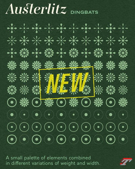


With Austerlitz, we set out to design a very reduced set of vignettes in weights and contrasts, adaptable and combinable.
➽ https://t.co/b85L14OhOv
💡It was with Ambroise (2001) that we started designing sets of vignettes and borders adapted to every weights and width.


2/ the arrows piercing her neck. The words on the moon 🌚 ‘can’t wait to see how I’ll die’. The jarring contrast between the dark themes of the work and the bright exuberant colors. It’s a piece I’ve already spent considerable time thinking on since I first saw it.