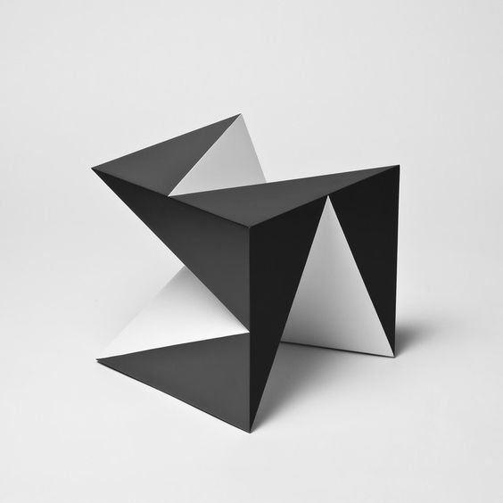
CONTRASTのTwitterイラスト検索結果。 10,552 件中 471ページ目


The finished drawing, pen and ink pointillism contrasted with layers of coloured pencils 🌿 This is another piece in a series exploring polarisation, cycles and decay - more of the thoughts behind it will be shared soon in a blog post! #art #conceptart #medhums #welshart #swan


Some favourites from 3rd year. Painted in #watercolour and #gouache They are two contrasts originally meant to portray the way I felt about my hearing but that doesn't read well. As pieces for #weather, they're great. Silent #snow and chaotic #storm I still like them


"This is the Stand I designed first, as a boss, to contrast with Star Platinum's color and other traits. By countering Star Platinum's super speed with time stop, we get a battle between two characters with similar abilities." — H. Araki’s commentary on The World, JOJOVELLER.


Went back into one of my smallest bovine paintings (16” x 16” / Acrylic on wood panel) and added a little more texture and contrast. Close-up video in my stories. She’s just a gal chillin’ in a field. We all need to chill in a field more I think 🙂 I’… https://t.co/zlE8LmjiTU


Monday Flash err quickie! Watched the @tic_pix Players Only interview of @dwyanewade and have always loved the white toe contrast of the @converse signature series. What a career. 👏👏👏👏👏 S/O to @deewellsosd for the sketch idea. ✌️ Ok, let’s get it… https://t.co/rsjqaqW4Il

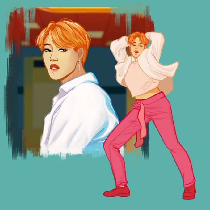
Hi some mv stills cause I'm weak for Jimin and blue/orange contrast
#jimin #btsfanart #boywithluv


The punchcutter had to visually adapt his design to the engraving size. The aim was to optimize the best contrast and general weight, but also to respect both design’s and reader’s needs. https://t.co/DVP5jTqoFb


Retiro https://t.co/DVP5jTqoFb is a synthesis of these high contrast styles mixed with an Hispanic mind. Result is then, after 2-3 years of work, a typeface with countless variations.


trying to force myself to be less terrified of high contrast rendering. I love it in other people's work but I'm terrified of committing to it myself.


Learn tips and techniques for tonal correction layers! In this tutorial, Japanese illustrator Kina Kazuharu teaches how to precisely adjust the contrast, saturation and atmosphere of an illustration using the tonal correction layers.
https://t.co/KXhFz1eYgS
#clipstudio


"I want my images to tell a story. I keep them simple with a moody contrast and a nice pop of color. They often end up looking surreal"
See how Phil de Glanville captures & edits his aerial shots and his secret to efficient editing: https://t.co/ljpnz8ZgTd @Lightroom @Photoshop


Old self-portraits. They're both based on the same photo with brightness and contrast changed.


Seems like #PortfolioDay was yesterday but better late than never I guess.
I'm Louis Grieves, French illustrator. I like pop-colors and pop-culture. Let's push your timeline contrast saturation a bit shall we?
Instagram, Twitch, ArtStation: @LouisGrievesArt


I tried scanning some of my Hollow Knight inks and messed around with colour and contrast to make them nice :c
Anyway Sherma is best boy.


