ContrastのTwitterイラスト検索結果。 10,503 件中 471ページ目


Made a little Florina wave to welcome new people to the Florina Discord server that I mod. The version on Discord is a lot higher contrast though, since it's hard to make out when it's so tiny.
Look at this soft and fluffy girl, though. I'm love her. :)
#mairdraws #FireEmblem


Alex~ I changed a few things so there was a bit more contrast in her design.

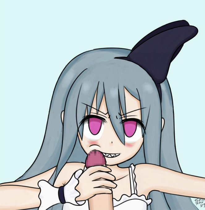
Demon hunter from Labyrinth of Refrain gives a BJ notice the sharp teeth in contrast with the soft sensitive tissue of the penis. #pixiv https://t.co/0oKEQRwpoO


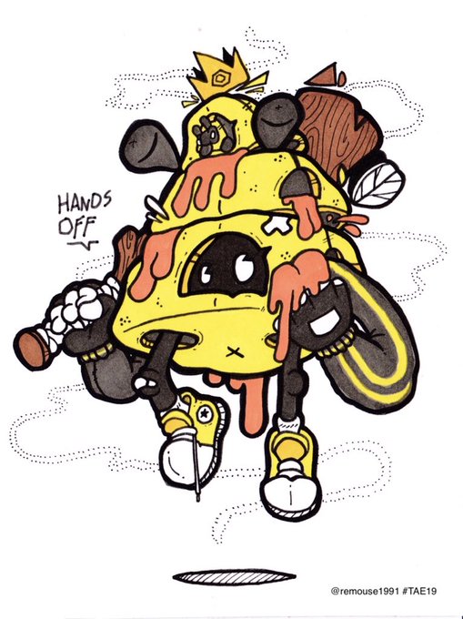
And a complete contrast here’s @remouse1991 Hands on the Sweet Stuff. Luuurve this quirky #artcard for #twitterartexhibit #TAE19 fundraising for @artinhealthcare All cards go on sale in #Edinburgh 11-13 May and thereafter online.


finally the color version. I'm very proud of the contrast between the light and shadow. #digitalart #fanart #megaman #elecman #starman



"At the Heart of Darkness"
In those somber times, it's always a comforting feel to bring out a little bit of light…
This illustration was made as a sort of practice of strong contrast, and also darker ambiance as well.
#brony #MLPFiM #mylittlepony


Poppy and Faith.
I LOVE drawing Poppy. She’s a wonderful character, one of my favs from Faithless <3 And I love Faith too. They make a wonderful contrast. (1/2)

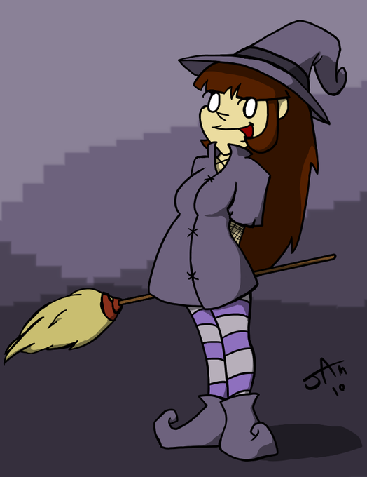
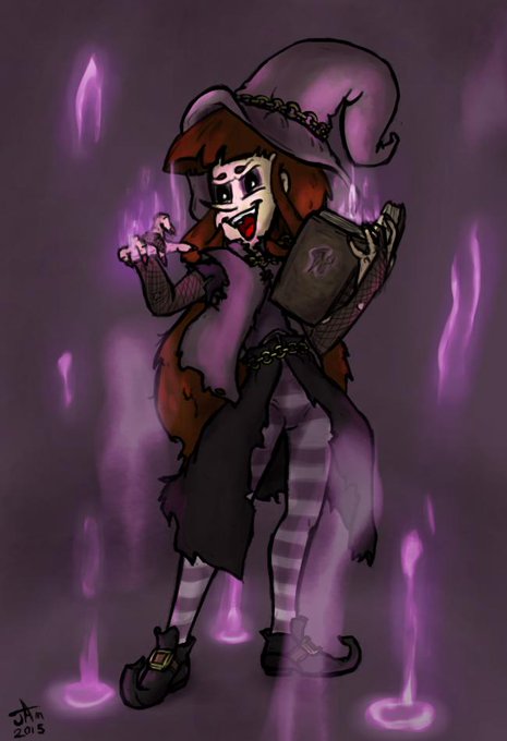
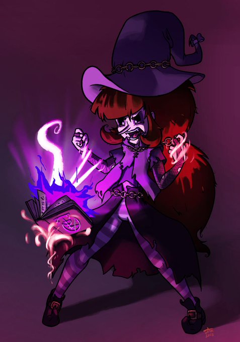
Why not. I have a good subject for comparison.
Aside from more obvious things (like poor Mary losing any hint of a chest), I notice I've gotten more comfortable using more contrasting values, while I used to be pretty anal about keeping values relatively close and even.




20190325
really wanted to get this idea out. uta looks nice in lunarian clothing. but there really isn't much contrast...
#housekinokuni
#readyyy!


My progress in the world of 'Concept Art'. Would have been a cooler contrast if I was older T_T
2014 > 2017 > 2019
#ArtMeme #oldmiddlenew


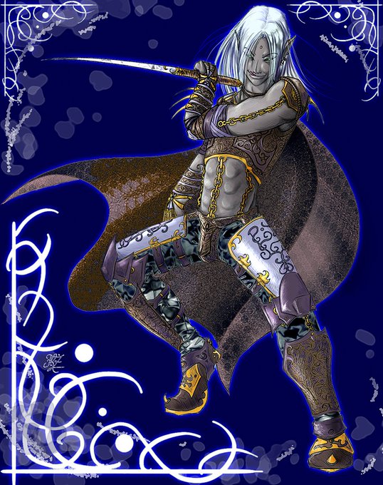

.....Contrast with my digital work from the same period: IT'S BAD, FOLKS. IT AIN'T GOOD.

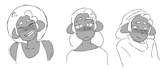
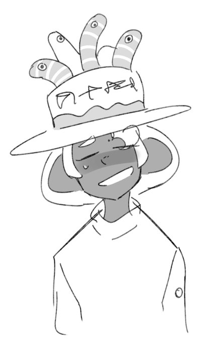

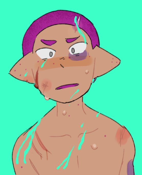
REQUESTS FINISHED thank y'all :') ( I'm so sorry about the frickin' Contrast happening with Jos lol..... )

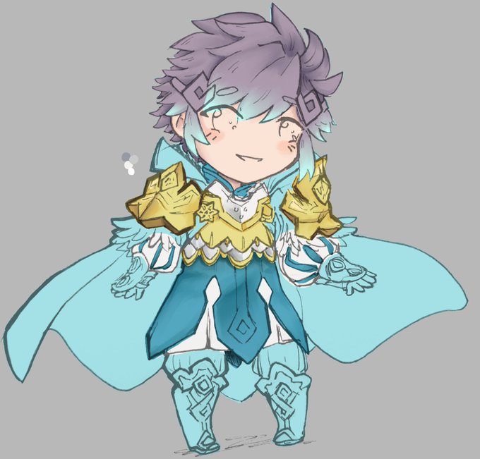
More Hríd progress! His armor defo needs some more contrast but I'm taking a quick break ovo
#WIP #fireemblem #FEH


A reluctant Bora decides to show more skin than usual... in a mix of contrasting feelings #furryart