compareのTwitterイラスト検索結果。 477ページ目


@johnnyhumilde @ElGranAlexis1 omaigad el alexis god, alexis we yo le hago sus emotes compare bara bara, wachese le dejo algunos que hice para que vea de ejemplo tan medio uwu pero se lo puedo hacer como guste 🤑🤙 4 dolares cada emote


J'ai envie de le faire mais on me compare jamais à d'autres personnages pour mon designs. On me compare pour mon pseudo :
🤡
(Je respecte qu'une des réponses....
.
.
.
.
.
.
.
.
.
.
.
.
Aquakwak) https://t.co/t5VoERtWnE


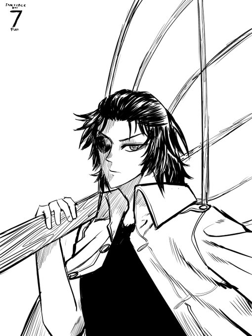

Just finished making the 6th to 8th this night. Pretty exhausting. And the quality isn't that good if to compare with the previous one.
#inktober2021 #inktober


D-Frag! Volume 16 Cover
Has anime
Kazama Kenji likes to believe he is something of a delinquent. But he realizes it’s nothing compared to the 4 girls in the club he just got tricked into joining.
@gomanga has the official English release


I've drawn allen avadonia consistently and long enough to compare my art progress using him and him only god bless


Today's color-contrast pairing is Donald/Daisy Duck from Disney! 💙/💗
The two are the more contentious couple compared to Mickey/Minnie. Regardless, they are in a loving relationship, making a fierce team. Daisy is often the only one who can understand Donald's speech quirk.


Finally got to finish a drawing 😆
Changed the coloring style for this compared to the previous one~
#LEOの遊び場 #山田涼介 #HeySayJUMP


@MomoChiruu If you insist, but it's nothing compared to you tho 👀


I tried ibis paint x on the new phone I got, and um it's pretty good compared to my past experiences??
Sorry everyone I was away for like 2 months-
#ibispaintx #ibispaint


5yrs ago compared to now
i am now significantly more gay and also trans https://t.co/h092sONkPf


I need to simplify her markings. It looks too busy, especially when compared to single color shading.


Day 6! I’m actually pretty proud of this one haha. This one felt pretty solid compared to the previous ones. Constellation! #witchtober can you guess which constellations I used? ALSO @_Kright is doing an awesome job still!


Few things compare to the feeling of hugging your best friend, and @HappieFerret agrees!
Amazing artwork by @AttacRacc! Thank you so much!

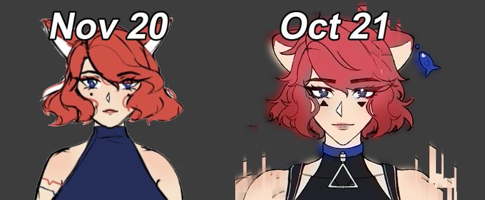


comparing my first drafts of characters compared to recent art is so wild to me...growth <3


Day 7 of #OneDayOneHue
Colour: Chocolate No.2
Character: [Loosely] Tahno from Korra
[To compare- Left: 2021 Right: 2012]
#illustration #ArtistonTwitter #fanart
• Click link below to view in full view•
https://t.co/pBZcJaveG2
☕️https://t.co/4t6hqPFtds 🎨https://t.co/l8MYsgIBpM


@sksktktk @genkazu1986 I tried drawing an autumn theme some years ago :P
Compared to さくたけsensei it probably is not in the best quality.
数年前に秋のテーマを描いてみました :P
さくたけ先生と比べると、おそらく最高の品質ではありません。




@adribbleofink S-Video looks gorgeous on it, but I'm sorry to say that haven't been thrilled with composite. It's sharp, but introduces additional artifacts and weirdness that I've never seen on other sets. Here it is (left) compared with my consumer Trinitron (right).


I thought I posted this. I didn't. Such disappointment.
He go bite. Mf has tiny ass hands compared to his bf lmao.
#art #artwork #ArtistOnTwitter