imoのTwitterイラスト検索結果。 12,992 件中 477ページ目


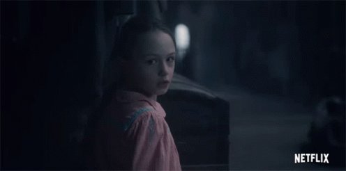
Halfway through #HauntingOfBlyManor and frankly growing bored. I’m still interested in the characters and the mystery, but it’s a tad repetitive/redundant as far as imagery.
I loved Haunting of Hill House so I’m def comparing the two. Tighter pacing in Hill House imo.


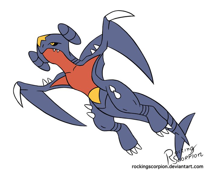
One of the coolest pokemon designs imo. But dayum he challenging lol.
This might be used for something else but not sure yet.
Also I'm probably skipping tomorrow cause I won't be home for a while and wanna sketch a background. In any case, hope y'all like it and see ya next time.


@beastofyeast1 In the Melee pic, it seemed to be a bit decent. There it looks more like a snout, rather than a disconnected sphere
Mario RPG's depiction is pretty good imo. Not perfect, but fairly decent for an early 3D design
This Line calendar is a pretty good 3D-ish depiction too.


shirtless greg in “gemcation” isnt as hot as it should be in theory bc the composition/boarding of the shots w him in it sadly aren’t too flattering imo. HOWEVER theres an official model sheet of shirtless greg somewhere and until i see it my soul will NOT leave this realm


Oh zarude's shiny is so sad. Adding yellow to the mix could've had potential but it just really doesn't work imo


Lockscreen from earlier this week (Decided against shading for this one. Looks better flat imo)
#digitalart #lockscreen #commissionsopen #fursona #art #BlackArtist #wacom

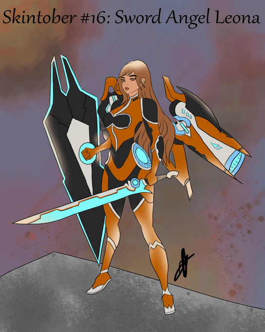
Skintober by @EraiViolett #16: Sword Angel Leona!
Probably one of the coolest I made Imo. So much fun to do!
#Skintober #Skintober2020 #LeagueOfLegendsFanArt



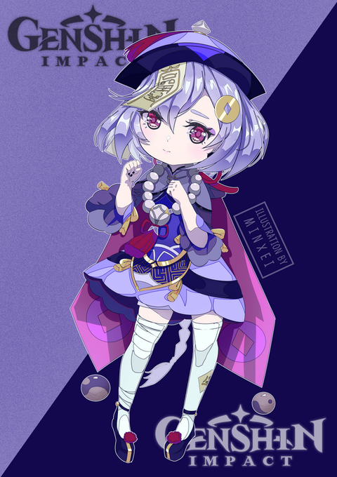

Honestly the cutest character in Genshin imo
#七七 #Qiqi from #原神 #Genshin_Impact !
#genshinimpactfanart


Fairly quick Katalina! Her design is fairly plain but that’s good for military uniform to build cohesion O: She’s supposedly a science type but holding a book gives her more of a librarian vibe imo #MSA


🧜♀️Lune🧜♀️
A #mermaid concept I made because I 💙LOVED💙 the packaging of @colourpopco blue moon shadow palette. I started some other character concepts for the other palettes too. That brand has some /AWESOME/ packaging designers imo 👀
#visiblewomen #illustrator


生き物にh...ンン゛.....生き物に "も"優しいこうたん
#koutanアート #imo64アート #こういも #50人クラフトイラスト #50人イラフト