colours.のTwitterイラスト検索結果。 4,218 件中 49ページ目

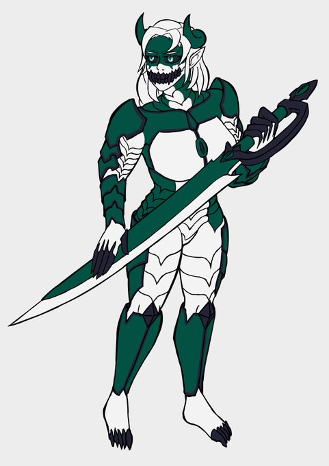
one step closer. Done with the colours. Adding shades and posibly after effects tomorrow


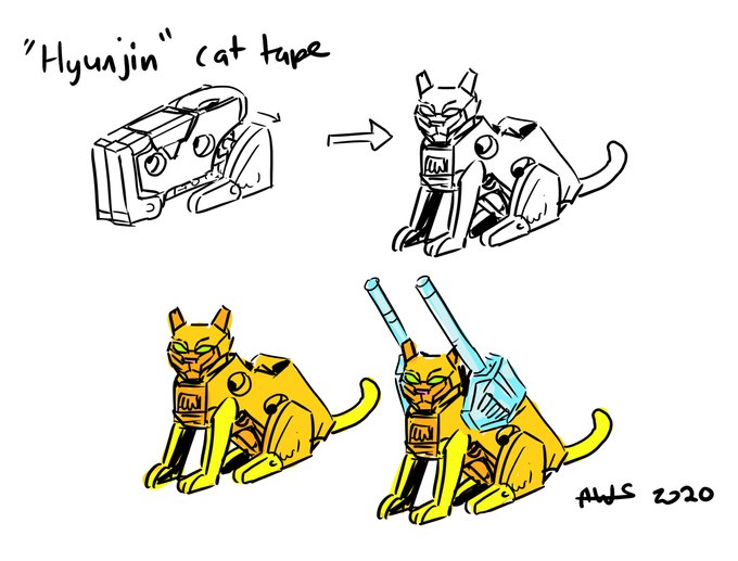
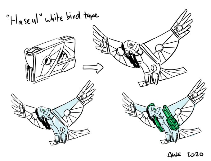
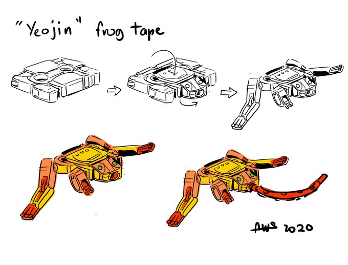
I'm a big Kpop fan. Couldn't you make tapes into collectibles that directly relate to Kpop groups and sell them to Kpop fandoms? Course you could! So here's some LOONA themed designs from their token animals/colours. More to come. #loona #loonafanart #transformers #tftapetoyline


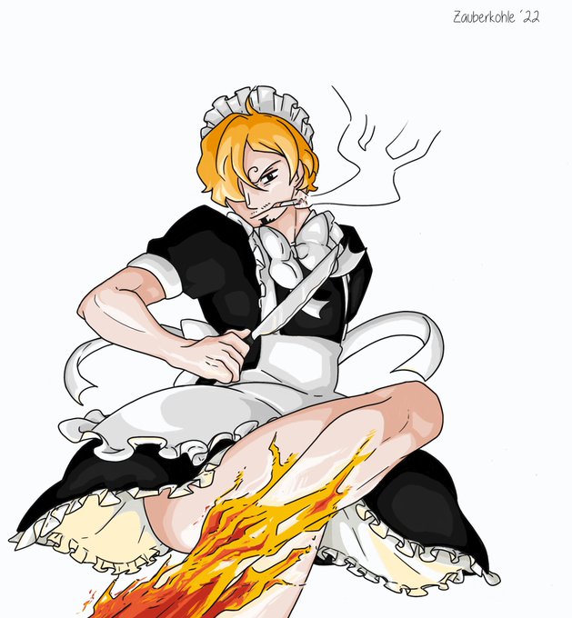
Perhaps, one day, dark colours and me will be friends.
I, again, had no clue what to do with dark colours.
But more importantly:
Never underestimate the cook!


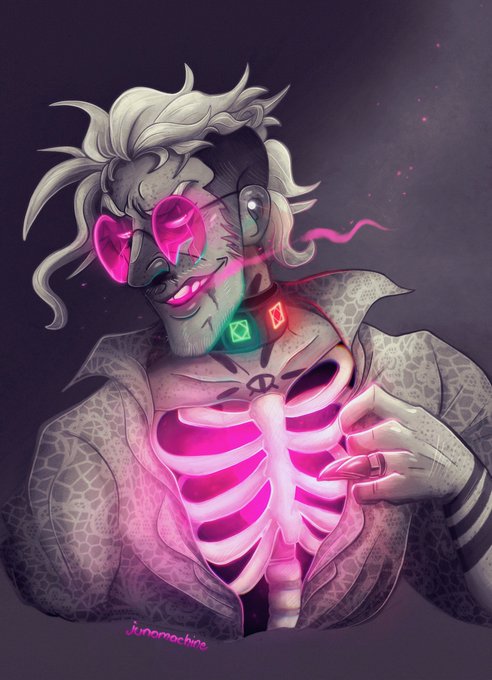
Drew them in January and still like the first one a lot 💖 Monochromatics with a lazy dash of colours.
#originalcharacter #OC #originalart #digitalart #Procreate #ArtistOnTwitter

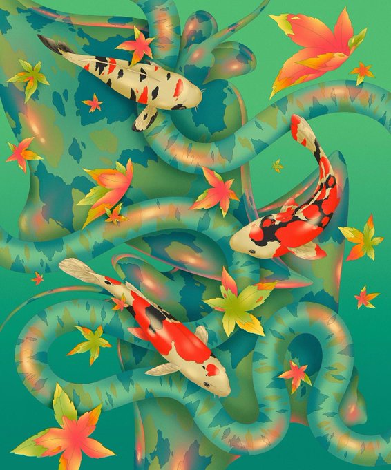


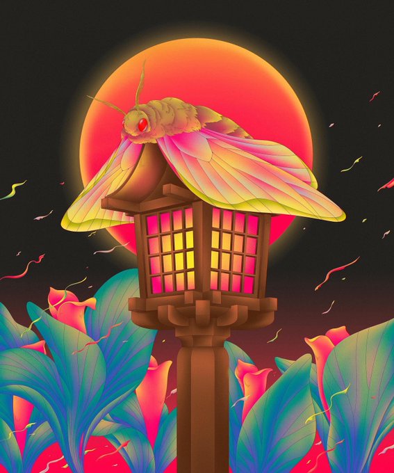
Pieces from ‘Pond of Ponders’ a collection by @liliptae on @withFND
Lili Tae is an illustrator based in Bangkok, Thailand. She draws inspiration from her subconscious and transfers her experiences through mellow strokes and soothing yet vibrant colours.
#NFTCommunity


The collection's centrepieces are undoubtedly the 'Negatives', named appropriately for their contrasting inverted colours.
With additional touches of colour, these rare pieces distinctly stand out from within the collection and will surely be sought after.
3/x


✨ Mademoiselle Variation ✨ by @czerednikow
"Mademoiselle Variation is an abstract portrait of a young woman. She is represented through geometric forms and vibrant colours. Can you find her?"
https://t.co/WQ1sARDDbj
#ContemporaryArt #MintGoldDust #NFTS


Drew a last gala quickie that @maxxdicking coloured in "monochrome" 'cos he still hasn't decided on his colours...his tiefling rogue and my fallen aasimar cleric (sorry not genasi!).
Thanks to @VickyPandora for a fun #OCGala2022 (and bg)! #dndart


how is everyone today? I hope you all get some sales!
Check out my #tezosnft #Tez #objktcom #objktnft
collection, Saline Watercolours. Your eye will pop!
https://t.co/t0HI60gyVB
some familiar faces in it too. #pikachu #jakethedog #adventuretime


Had a crack at colouring one of my inks. Im a bit rusty with colours...but I kinda like how this one turned out!


did the new colours. also first attempt with a chubby person, i think it came out decent
mango belongs to @Lego88fan


Made chibi Chilleds based on his outfit and colours. I like to think these outfits represents his main personalities. One is like his "chaotic" and youtuber persona and the other is like a "chill" and casual persona. #chilledchaos


@MonstersGo But back to the original topic:
Yup, the C64 has more muted colours than, say, the ZX Spectrum. 🤔 The Amstrad is in the middle. Then the Atari just shows off with its wide array of colours. That was the beauty of 8-bit machines: their arbitrary, rigidly-defined differences. 😄


@MonstersGo When I was a kid, and had a real C64, it was the early PAL model, with slightly different palette to all later revisions. So I've never been entirely happy with the default emulator colours. The first thing I do with VICE is change the palette to Pepto NTSC Sony. I like that one.


First time going for such soft colours. Pretty happy with the outcome.
#genshinimpactfanart #Yaemiko


Taking some time to learn how to draw people.
Started working in black and white, then used a gradient map to add the colours.


A beautiful gift from @ArtistJoyJo on @withFND. Love the mix of colours. ✨
"No matter where we are, we must keep moving forward."
Title: No Matter Where We Are
https://t.co/nFYEQ0jCxR
https://t.co/zmb1Zkmfzt
#nfts #nftcommunity #cryptoart #digitalart


drawing four characters does require a lot of colours.
indeed.