ContrastのTwitterイラスト検索結果。 485ページ目


I increased the contrast in this pic and I'm feeling way happier with it


drew this last night as practice with contrasting values. based it loosely off of a small section in the backyard of my childhood home


Reposting. Fixed a few things that were bothering me and added a bit more contrast.
#persona5 #anntakamaki #nsfwart #fanart


Latest Art just in! Harvest Fields of Late Summer: Harvest Fields of Late Summer is filled with the colours of late summer – my eye is always drawn to the contrast of colours at that time of year – the yellow ochres of the harvested fields and this year… https://t.co/ozV0xK4Xpm


Paul Delvaux - The Sleeping Venus, 1944
Painted in Brussels during the German occupation while the city was being bombed, it expressed anguish contrasted with the calm of the Venus. It was seized from exhibition at the Julien Levy Gallery in 1946 by the US Gov't for obscenity


Saw a clip of #PeggyLee on the #JudyGarland Show and thought they struck such a contrast- both so beautiful in their different ways.


#시즌스
Lo que mas me gusto fue el contraste de colores que posee...
The spring is beautiful <3


11月1日です。
そろそろ寒くなってきました。
TKfrom凛として時雨さんのcontrastが恋しい季節です!
#TKfrom凛として時雨
#contrast


My ten year old self would have cried if she knew she would be working on a project featuring POKEMON. Also I love the neon/dark color contrast can you tell? #PokemonGO #pokemon #GengarDay #duskull #spiritomb #mimikyuu #sableye #pokebusters


I think that’s it. :D More contrast, a bit more details, some additional shadows and fire breathing #dragon is done~.


Couldn't do much art lately, so here's a little something i made a few days ago! It is very much inspired by @Stepponalego_ 's beautiful artstyle. Altough i'm not quite there yet, i absolutely love to play around with these strong contrasts!
#ArtOfLegends #LeagueOfLegends #Art


The Contrast Piece #art #artists #artistsontwitter #artistsonfacebook #digitalartwork #digitalartist https://t.co/ohPWKRPNEf


finished up that Lei-Lei sketch, tried to go for a high contrast shadow thing, might do that with the rest but heres a #CutieSaturday #Darkstalkers

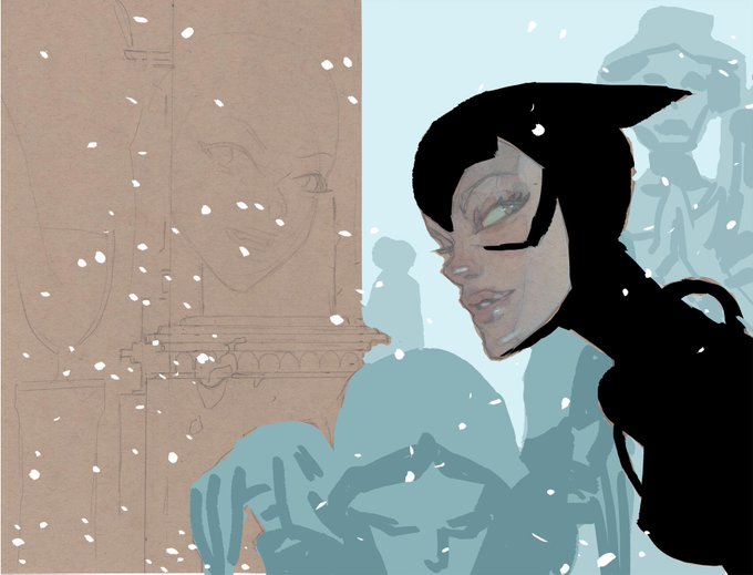
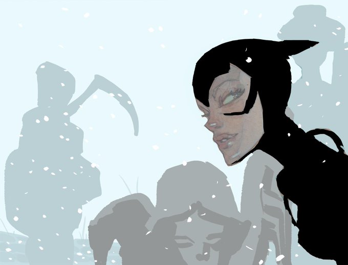
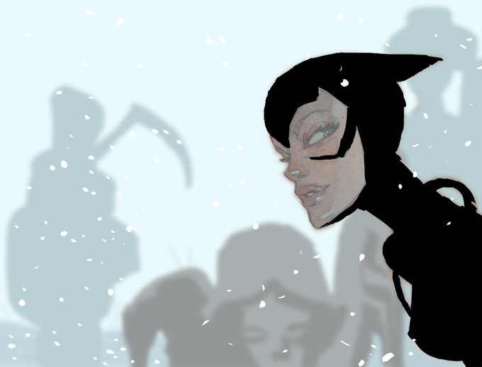
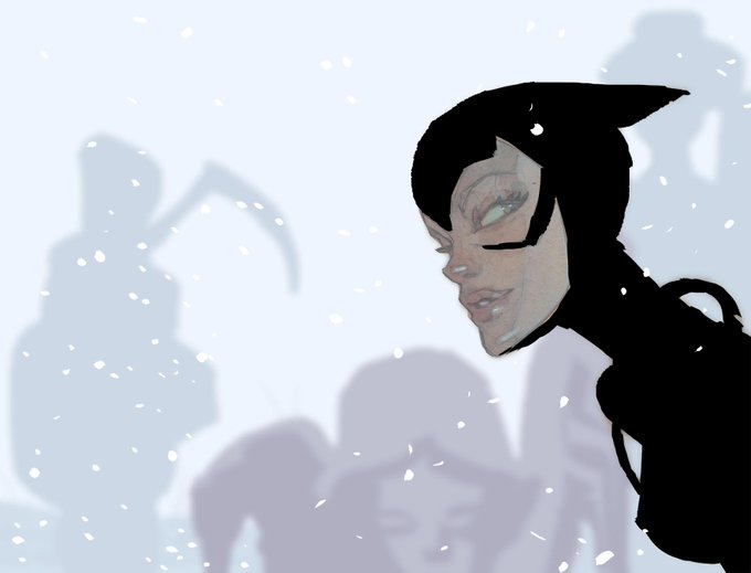
color testing, first with a green-blue bkg that i wrongly thought would be recessive, then a lighter, lower-contrast color, then that color blurred, and finally the winner -- a redder (pinker?) version that has the right balance of cold and distance. now for actual watercolors...


"Abstraction 271" Bold contrasts, luminous chromatic palette are my favorites https://t.co/SIsYCc013D #impressionism #homedecoration #abstractart #artgallery @SaatchiArt #artistic Archival Pigment Print on Baryta Fine Art Paper #artcollector #contemporaryart #abstractlandscape

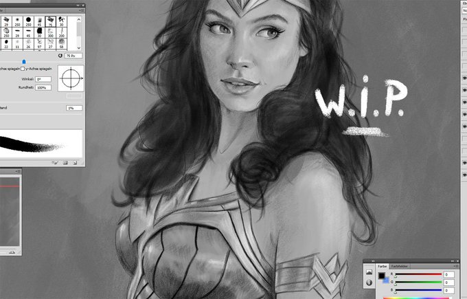
WORK IN PROGRESS!!!
Got some progress with working on dark edges and contrasts.....
#WonderWoman #GalGadot #digitalart #illustration #dccomics #character