ComparisonのTwitterイラスト検索結果。 22,248 件中 486ページ目


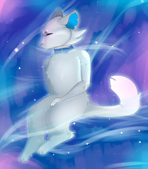
The comparison between those two is always hilarious to me because one is a reluctantly forced older brother who genuinely cares but is tired 24/7 and one is a dumbass who just wants his piece and quiet but never seems to get it. Both are sweethearts though (Nier will NOT agree)


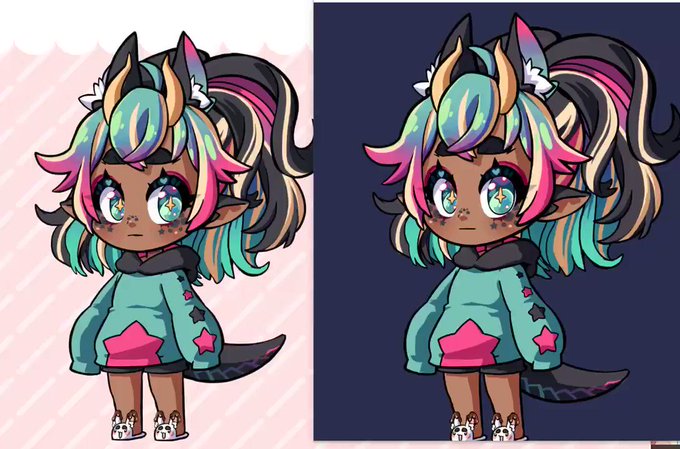
確認の意味も込めて、製作途中と完成絵の比較も少し。
(I will upload a comparison of the art in progress and the finished art, including the meaning of confirmation.)


Tired of seeing people talk about the Pokemon Legends graphics
It doesn't look as good as it shoulf. Both Xenoblade games and Yokai Watch 4 look better by comparison and are running in the same console

quick comparison i did
Left is VTS is iphone 11
Right is prpr with game animoji dlc
cameras werent lined up super well so there's a bit of difference in angles


And this is a one for one drawing of younger Sheet. Based on how she actually looked back then when I first drew her. Here's a comparison as well. ( god that old art looks horrible )


Changed my eye coloring heh.... i followed a tutorial but i rly like how it came out :] also very spoiled on csp brushes (comparison with a procreate drawing)


while im working on fnf fanart heres a comparison of my art from like 2015 to now


2017 / 2019 / 2020 / 2021
Sona art for easy comparison! 2017 was when I first drew Sheryll as an anthro, but I didn't ... REALLY consistently draw her anthro until 2019 https://t.co/qJVNYixVGR


I’ll put comparisons before and after here
1) Exhausted mama venti @nuupon


My sketch and colored versions of my first sexy Spice drawing, it's a repost but a comparison.


Hey so I haven’t drawn at all since like- my last drawing I posted and I was finally able to draw today! Although it is a redesign of my own character and while I know it’s now my normal stuff I hope you appreciate just as much :) The second one is comparison


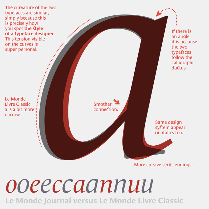

You know these two typefaces, but less in a finer comparison. The challenge of a super family is to establish common principles and structure, while looking for the difference: those nuances that will help the contrast. Le Monde Journal, intended for small sizes, is the base… 1/

The customisations options in BDSP make OrAs look much worse in comparison lmao #Pokemon #Sinnoh #Dawn #PokemonPresents


Now that I've found a lot of my old art from middle/high school, I'm able to make comparison pics. This is an old character of mine I've had for years... their design hasn't changed much but my art style sure has. It's so weird looking at it all lined up


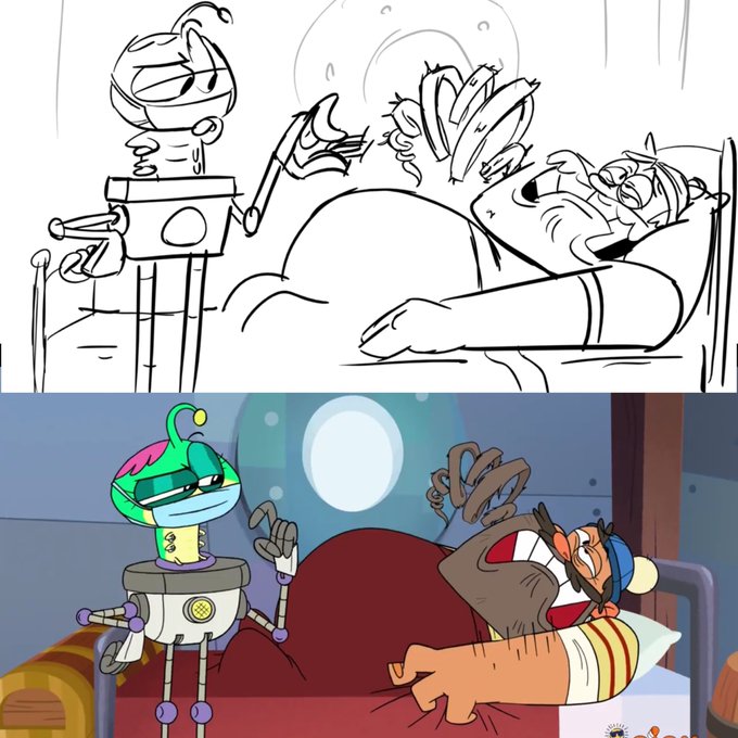
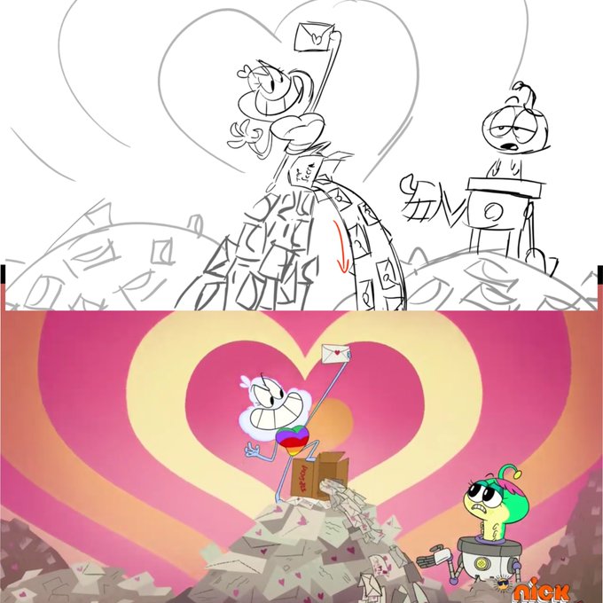
Here’s some choice Storyboard to final picture comparisons for last weeks new #middlemostpost episode, “Love Letters!” 💌 (1/2)


Animal skulls comparison: horse, cow, dog, lion. Did you know that cows don't have the upper incisors? I didn't 😛


//TW: bloody horror creatures?
-
-
-
-
-
-
-
i needed to do a ref and size comparison sheet for them ahjdhsdhja big gals
the ritual mafia members call them to execute betrayers or ppl they need to sacrifice or something