contrastのTwitterイラスト検索結果。 11,050 件中 50ページ目
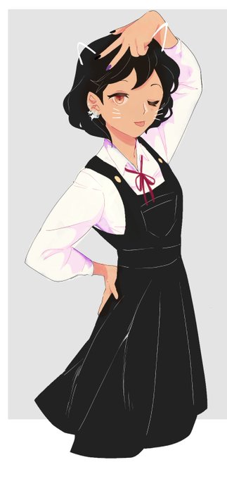
here's my other character that hangs out with beatrice, suzy. she's like, a happy go lucky hippie so it's contrast to beatrice's crankiness
There then begins a long and fun phase of discoveries and experiences - analysing and selecting which ranges of parameters are to keep, completing and adjusting colour palettes, and working on contrasts, structure and composition, until the vision finally comes to life.
7/10
Me persona :3
Man sometimes I love to endulge myself by drawing my mischievous, insane, gremlin self (minus glasses lmao)
I hope the colors aren't too inaccurate, since I can't adjust the contrast on my laptop :/ without contrast, calibration kinda doesn't do a whole lot for me
@Orions_Law i thought red and blue-ish would be Fun Contrast
Segurem o emocional que ele está querendo cometer graves delitos!—🌜
(Chorar novamente)
(Rascunho de paleta de cores de personagens, tentativa básica de criar uma interação com cores que envolvem alegria e tristeza para mostrar o contraste de personalidade entre meus personas)
TY @MoonkissesN for capturing my Azuki in what would be a "day in the life" perspective. Love the colors, contrast, and pov. 🔥💕 @AzukiOfficial ⛩ https://t.co/fCUGKlSSkf
some contrasting gems from @_Julia_Jane ! Eeesh!
#xrpl #nfts #xrp #NFTshill
I had an absolute blast drawing this lovely commission for @TyTwinny's oc giving @Confetti_Cakez a 'welcome back' hug! The colors contrast between the two is phenomenal :) I hope you enjoy it! I tried them out in the #mlpg5 style~
Honored to draw @MBTYuGiOh 's Contrast Hero Order!
one big golden boy.
#yugioh
@BunkoGenki 2020 vs 2022
It’s a style I liked and wanted to improve a bit more on, add a little bit more contrast as well. c:
stealing this from my friend:
anyways me and the bad bitch I pulled by being autistic
(their contrast is silly to me) https://t.co/uvj3dPYEoz
OC vs inspo!
Blaine has some inspo from Davis and Takato (including the contrasts if that makes sense) and his hairstyle and outfit are based on John Connor as with some of his personality. His body type is similar to Bon from Blue Exorcist!
He's also thoroughly based on me
Vader and Little Leia from sketch to finished digital painting. The visual of Anakin peering through Vader's cracked mask was too good not to paint. Leia in white with holster is a good contrast to Vader too.#DarthVader #LittleLeia #StarWars #fanart #digitalart @ArtMutuals
Alpine characters are just dudes, after dudes, after dudes! And everyone is so threatening too, I'd like to add someone who is soft.
Someone who can establish Monster Vs Humans, I think that contrast is necessary for monsters
Lemme know your thoughts, I'm still brainstorming.
@MattMcMuscles @DonWoka C because of the callback to 2nd Impact’s arcade poster. The contrast to covers like this is to showcase how the legacy of SF is now in Luke, Jamie, and Kimberly’s hands to define the nature of what made the series great in the first place just as their predecessors did.
☄️NEW DROP☄️
“Well, it's not a good morning”
0.08 ETH
I like to packege scary events in vivid images. This contrast enhances the impression. It's a scary situation, a meteorite falling, the eng of the world. But it is drawn very vividly and satirically
https://t.co/V5C3TlJPBW
Vee and Masha with japanese school uniforms(I love the contrast of these two)
#VeeNoceda #theowlhouse


