BetteのTwitterイラスト検索結果。 331,347 件中 496ページ目
Do you think the wavy/fire-like cel shading fits better in my style or the old curved one?
D4 // prince 👑
(better late than never!)
___
#SanjiWeek2023 #SanjiWeek #sanji
#ONEPIECE #サンジ
Oh yeah here's some better art from a lil bit ago by the way.
We love cheeky demons in this house 😈
(ft. @sinninenbun's Neo)
Here is a better quality, it's free https://t.co/FsNweND1c5
BEFORE AND AFTER, NEW LOGO DESIGN. I wanted to change it to better suit how I recently designed my oc, and ngl I love how it turned out, I also fixed the hiragana- #LogoDesign #Logodesigner #ocart #characterdesign #ArtistOnTwitter #art #ArtistontheRise #artists #artistsontwitter
@OnTheDownLoTho hold on u onto something, i did do something like that a few years ago but i think i can definitely do them better now
Did my first ref sheet ever; not going to lie. It's not my best work, but later in the future, I will develop one that is better. But this is a good start!
@FireKingFero helped me make her hair better and ill edit the texture later to be less basic. But at least its less strandy
result of my uni assignment 🌷💗✨
—; its a visual map of myself to understand myself better and explore more about my strengths and weaknesses ˚⸜(♡ ॑ᗜ ॑♡)⸝ ˚
So I changed the words on my art piece and wanna see which you think is better
Not gonna lie I never have enough energy to actively post a lot on twitter, maybe a sleepier aesthetic might be a bit better. We just be vibin all the time with snacks
Something I need to come to terms with is that sometimes it’s better to not use white as the highlight color
Im too used to making super saturated with bright blaring highlights, it’s def fun but for more emotional pieces it actually lessens its meaning especially this one
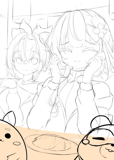
made drafts and the first one i made has such a boring composition i hated it, i tried to change the perspective and it looked way better!


