adjustのTwitterイラスト検索結果。 14,152 件中 497ページ目


dang that background color looks so much better on my not-so-color-accurate-laptop-screen 😂 nah I'll adjust 'em tomorrow . the real problem here is what color do i use for the inside of the mouth 🤣 #artph #ArtistOnTwitter #Artist #artists #LISA #BLACKPINK @BLACKPINK


Mistigram: do not adjust your display. This #pixelart portrait of #SpiderGwen was drawn by @pix_emme and included in last month's comics-themed MIST0720 artpack collection. https://t.co/2yJeMvm0hz


I adjusted her coloring a bit. Also the hair I like better but doesn't match the description.


Would needsome adjustments but sure.
Weaver Finn but in a dress. (Probably would make it more goth-)


Did this on Clip Studio Paint!After 11 years on SAI, adjusting to a new software is going to be ~A~ process 😂
I can't deny that the sketch version of this has it's personal and unique charm, but I'm loving this full fledged version a lot!


@Saniedoes @Legoguy9875 @nsfwo262 in my case i make the clothes by hand and adjust it to fit their figure - currently doing something for marina too!


Just some slight adjustments, about ready to do a final detail pass.
https://t.co/ZJ9QsehWkm
#digitalpainting #art #patreon #characterdesign

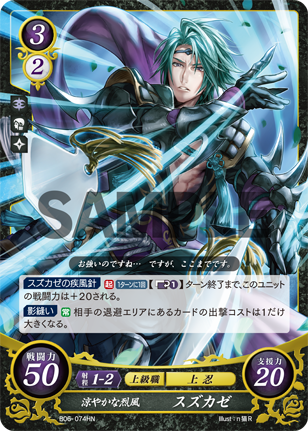

The deployment cost change is a reduction and not a fixed adjustment, which still lets Sothe become c3 or higher through a card like Kaze (rare interaction)
He's a good assist for the queen Micaiah setup before she becomes level 7 but this is important to keep in mind


ok ended up adjusting the colors a bit and going with this pallette, need to think of a name for him still though


@Senswii I feel bad for self advertising buT. I can do one! I can adjust the canvas accordingly and fit the character in however you want.
Commission prices/TOS are in a button, it should be easy to find. :D
https://t.co/tYqvPMMHT0


Once again, I love showing how things evolve from my dumbass script, to adjusted lettering pass, to final page. Fuckin' hell I love this comic. https://t.co/JplrXRN44N


@arythusa its flats! I think what makes it is the cohesion with the school colours, the fact that the lineart is a medium dark red multiply layer instead of a black one (multiply makes it so it adjusts to each flat colour) and also little gradients on skin!


Here is my UPDATED COMMISSION prices and form! Prices have been slightly adjusted to make room for a new addition, COLOR! Here are some examples and the link to the form.
#commissionsopen #commissionart
https://t.co/tLFo62yBnT

yO, for @xgrtrdx mom niya uwu (forgot her earring pero she still looks gorg🤟✨) colors sa comp di same sa phone pero yeah, adjusted some color ekeme 😅 still not happy sa color tho pero sige go lang
THANK U FOR JOINING THE RAFFLE ❤️
---
#art #artph #digitalart
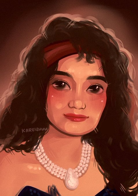
IG: @kareisuuu


for context -
- Hard, thin lineart from the beginning
- soft shading/non-distinct brushstrokes
- no yellow/orange lighting
- no digital atelier
- no yellow light source
- adjustment with levels only
- no unsharp mask
- Had to draw Yew, who i never draw
this was hard


Snek Serperior 🐍
The original drawing is on the left, while I gave some some additional adjustments on the right one to give more highlights I can’t do with pencils 🙇🏻♀️