CONTRASTのTwitterイラスト検索結果。 10,546 件中 498ページ目

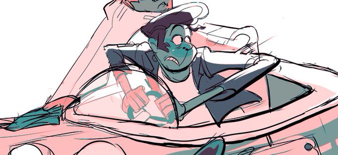
He's actually this fellow here! He sure has changed. I just thought he might have a funner visual contrast to Sasha if he was a beefcake. (I was right)


From Savage to Subtle; God of War's Tonal Contrasts
https://t.co/i6zT6a7U21


Love the contrast of these two together - Forgetting Passions, 1913, and Satan’s Treasures, 1895, by Jean Delville (1867 - 1953)

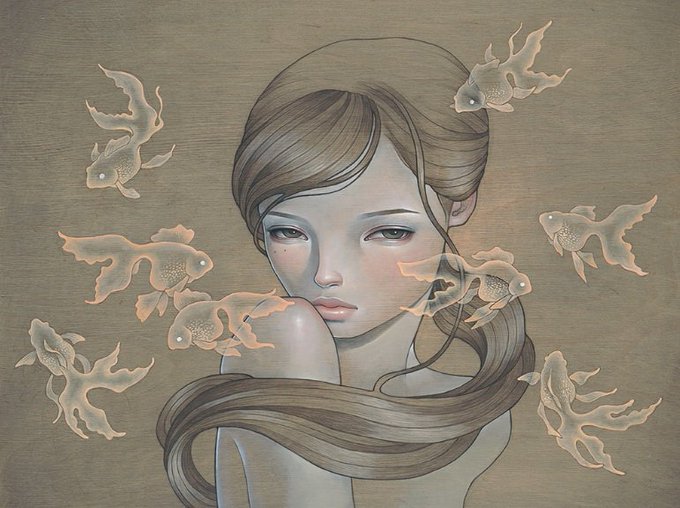
Audrey Kawasaki is a Japanese-American artist. She lives and works in Los Angeles. Kawasaki’s work contains contrasting themes of innocence and eroticism, conveying the mysterious intrigue of feminine sensuality https://t.co/zQ0iJkQxxy


Art by Julian Regino // The composition from each of his pieces showcases a combination of contrast, depth of field, negative space, as well as unique detail and orientation // Apply online to exhibit your work at https://t.co/1hMvu7oof4 #artvancouver


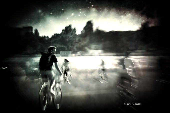
#王夢深夜の60分一本勝負
【秘密】Secret.
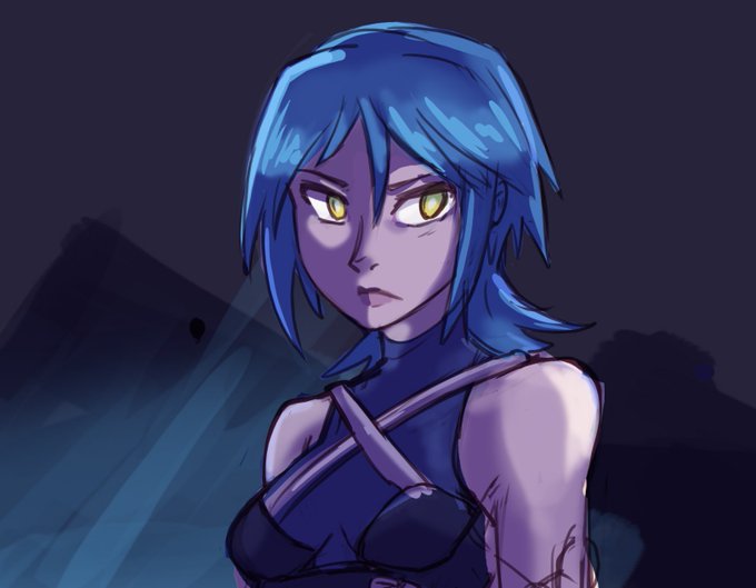
I tried to make something sickeningly cute to contrast the tone of all of my current work, but it ended up looking rather sinister instead;;;;


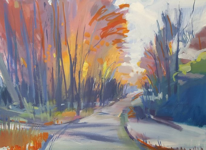
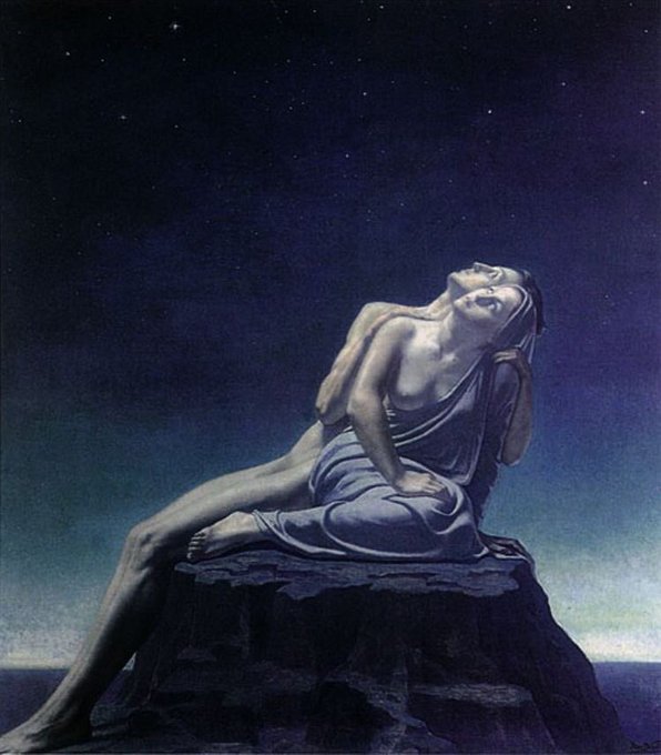
“There's often a 'magic hour' just before sunset when the low sun illuminates the landscape in a special way: making colours more luminous and contrast deeper. This scene was a good example, the late sun caught the autumn colours in the leaves... https://t.co/fCBctOGrpn


Volumizzante Rassodante Seno è consigliato per contrastare il cedimento cutaneo dopo un dimagrimento, dopo una gravidanza o per la perdita di tono. Seno più pieno e più sodo, +1cm in 8 settimane! Approfitta del -30% sul nostro Shop Online Ufficiale https://t.co/17SF06AJ6q


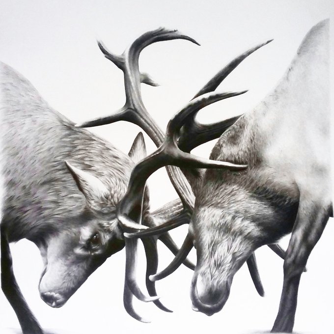
A fiery contrast between reds and blues level up the intensity of this legendary artwork. https://t.co/mPWOjV4OwM
#Dragons #Magic #FantasyArt

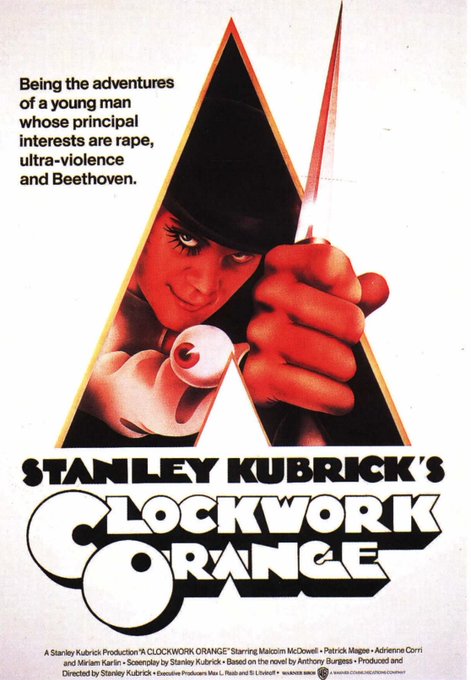


.@rodrigocor7es: “Una de las cosas que caracteriza el trabajo de Bill Gold es su ausencia de estilo concreto (en contraste, por ejemplo, con artistas como el muy reconocible Saul Bass). Gold se adaptaba a lo que pidiera cada historia”. https://t.co/OotWdg7iIQ (desde 34')


Al final lo he dejado más o menos como en el ejemplo con tal de variar un poco 💦
Estoy algo confusa con el resultado porque es diferente a loque suelo hacer, pero me gusta mucho cómo ha quedado el contraste de luces y sombras! ✨💪
#WeAreDragons #WaD @TheArtBond


Finally finished this piece, there is a weired thing about red and green, they are suppose to be contrast color which means they should looks good when you put them together, but , this composition is always considerd as ugly....but I did it anyway cause I don't give a FFF 😝😝😝

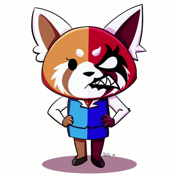
This has been something I’ve been thinking of making for a while now: Retsuko + Aggretsuko in a Monokuma/Monobear-esque render. Made some slight design tweaks to emphasize the contrast, and removed the Kanji since it was going to get sliced.
•••
#art #artph #sanrio #Aggretsuko

