compareのTwitterイラスト検索結果。 22,440 件中 498ページ目

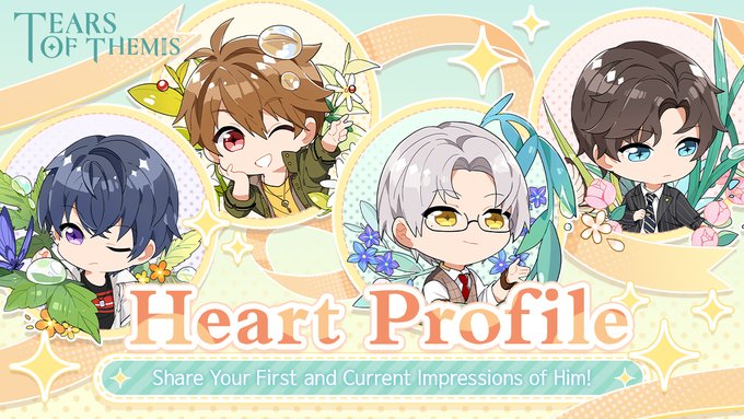
From the temple fair during summer nights to an isolated island at the start of autumn...
What differences are there between your first impression of him compared to how you see him now?
Join the event to win rewards:
https://t.co/rjoU8csLnq
#TearsOfThemis


QRT with your OC and the character people like to compare it with aka the famous sentence "this looks like...."
I have been told Edward is like the love child of Sebastian and Claude from Black Butler. I both love and hate this~🥲

✨Happy Shiggy✨ {Do Not Repost Without Proper Credit Please and Thank you!}
-
I needed to give some love to my other baby Shigaraki! Also I love the meme that compares his smile to that certain cat meme-
#bnha #mha #shigaraki #tomurashigaraki

Sorry guys your avatar projects are Super Lame compared to this!!!!
that is killer!!!! 🔥
https://t.co/5QU2SA2iwA
BEWARE of pirated collection in opensea.
and keep following the influencers that dump on you!
#NFT #NFTs #NFTcollector #NFTcollectibe #


// blood tw
just wanted to compare the sketch with the final versions


Every time it seems less likely that my ugly boy Kensou will make it into xv's Initial roster. Hopefully he'll be DLC, maybe with momoko and bao or some other team. Maybe I'm asking for too much.
Too bad he wasn't a good desing in xiv, compared to how badass he was in 13
Rip


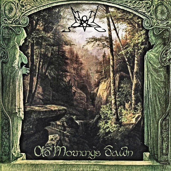


Still the best, most accurate, and most skilled band whose music is based on the Lord of the Rings and the Silmarillion. None can compare in terms of atmosphere and repeated listening. Not a single bad album. #summoning #lotr #tolkien #blackmetal


@GenTeddie23 Nah man don't compare, your art was made with effort and I like it thanks


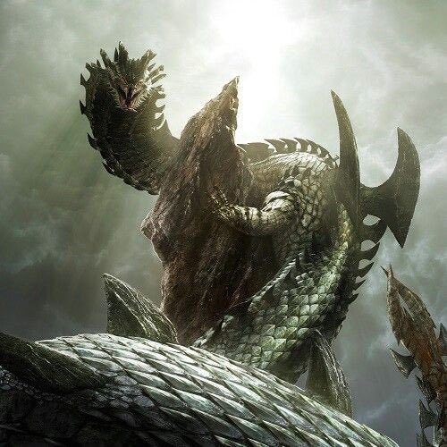

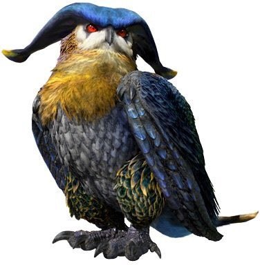
@Zinotsune Follow up would have to be these bean though. Seregios is like in my top 5 of all time, dalamadur is big snake so I must love, mizutsune is just beautiful 💅 and Malfestio is so unique compared to bird wyverns.


Shall we compare thee to, erm, The Shard? Visitors to Saturday's @BermondsStFest will receive a personalised composition by The @poetrytakeaway chefs. You'll find them cooking up words on the corner of White Grounds. https://t.co/ZgPjL6WlX2


this scene was so interesting though and i know they’re all different games, but when you compare Evan, Charlie, Lu Jinghe and Mo Yi’s perspectives of these things it’s neat #不属光夜只属于你


Obrigada a todes que compareceram na live hoje!!! Contamos uma novidade super importante: sexta-feira na mesa de Masks teremos um sorteio ao vivo pra quem aparecer no chat!
Vocês não vão perder essa, né?
~tine super heróica!


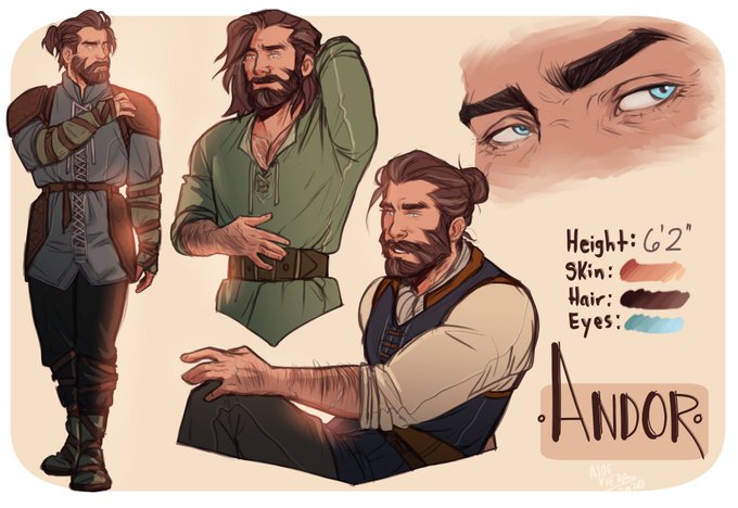

It’s time for my very first #1linewed !
“He is ethereal; handsome beyond compare and Andor is beginning to think, perhaps religion is not so terrible if it means worshipping at his feet”
Feat. Art of Andor by
@/AloeVieraB !

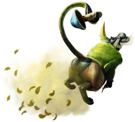
This individual's unique appearance also allows it to better camouflage itself. Compared to its pink cousin, Emerald Congalala has a more ravenous appetite and has much more gas built up in its body.


Rewatching Onyx Equinox and I forgot just how much I love how they depict the gods at their strongest as almost kaiju-like entities. It's unique when compared to how most fantasies just make gods powerful humans.
#OnyxEquinox #OnyxEquinoxS2


Aparentemente a Mizuho Kusanagi, autora de "Akatsuki no Yona", estava trabalhando em uma ilustração de Guts e Yona para a exibição de Berserk que está ocorrendo no Japão. Ela comenta que infelizmente não pode comparecer no evento mas que espera encontrar outras oportunidades. https://t.co/UAzF7uYInJ