COLORsのTwitterイラスト検索結果。 218,820 件中 500ページ目


Kingdom hearts inspired final fantasy commission for @Caydevt I had a lot of fun doing the colors on this one


Played with colors a bit more a I kinda like this version hhh https://t.co/1FUIKQhcwf


// cw eyestrain (potentially?)
soooo I finally got around to finishing up my entry for @oddingly_jpeg dtiys! had a lot of fun with the colors in this one ☺️
-----
#skysthelimitdtiys #tmntfanart #tmnt #tmnt2012 #donatello


Wasn’t sure if to post this here or not cuz, it was just a small practice with Procreate’s layer modes. BUT I like how the colors turned out — here is some Bebop! 😋


Banished: 🪛fabricating🚗
https://t.co/fPOuOrEI21
Written by @RyanComics
Art by @ManOrCatman
Flats by @deedala
Colors by @Buboniccc
Patreon gives you previews, exclusives and rewards.
And helps our comics get made!
https://t.co/eHPT3CzNyq


Gordon Porlock oil painting on wood panel, colors used; black, white, and payne’s gray with gold watercolor detailing. Inspired by Friedrich Von Amerling’s “Lute Player”

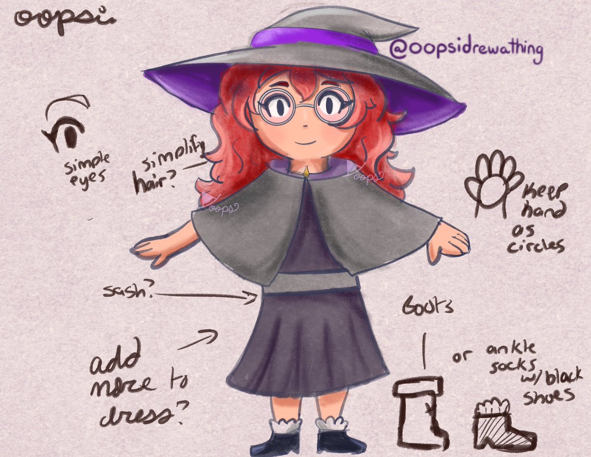
Working on figuring out the art for the new book. I want a more watercolor/pencil on paper look. I’m iffy on the clothing colors since I know kids may want brighter colors, but I want the hair to stand out more.


re tweaked the colors. after posting i saw how washed out they were. not anymore bam! #fixed


@mediolanum666 Every single time I’m just thinking that’s finished, but the next morning I have a doubt! And one day I just trying to remove whole colors and shadow and start again! The end of the day I’m just wondering am I creating this ? Holly Molly ! I’m a hero! :)))


Let's Fucking GOOOOOO (Colors By: @NoTanSilencioso)


1. Color again because I forgor 💀
I like hue shifting :] I mostly like, pick the colors myself instead of using multiply layers now
I think it makes the colors pop more
Same saturation and value, just different hues

Colors (cont.)
On the other hand, if you don't want something to be the focus of the piece, use colors with similar value/hue/saturation
I usually do this for backgrounds, I don't know what else to add here laskjdgl

1. Colors
Check the values of your colors by converting it to grayscale, that way you can see which colors pops out and which don't
Our eyes are usually drawn to parts that contrasts the most with other stuff in the frame, so make sure to make the parts you wanna focus on pop


“I feel hollow inside.”
My stress-free drawing I did today.
It’s pretty fun to let myself not care about what I should draw and start really focusing on what I want to draw
Also not caring about anatomy and colors too much.
#drawing #illustration #art #ghost


