CONTRASTのTwitterイラスト検索結果。 10,554 件中 500ページ目


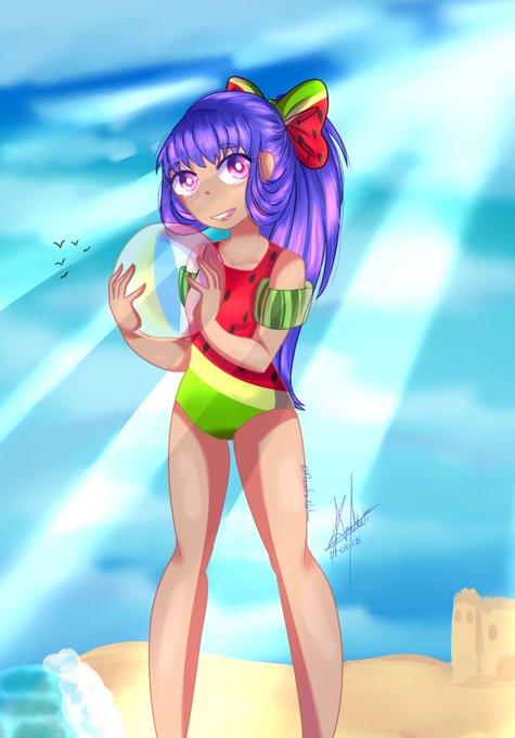
hola~♥yo aquí subiendo dibujitos con amigo aquí en twitter esa ves nada fan art aro si son #originalcharacter
una Thicc (intento) y una Loli (que contraste)
bueno espero que les guste uwu~♥
#originalart #digitalArt

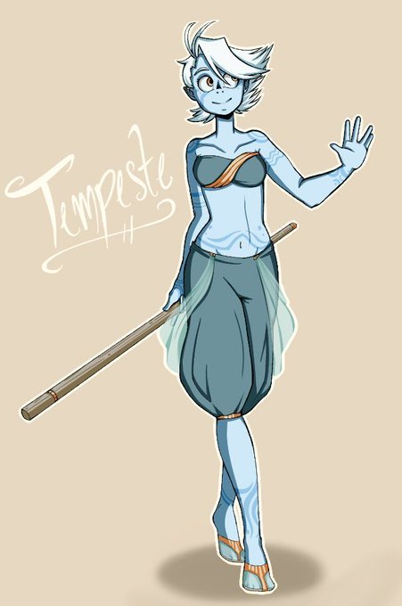
My first time designing Tempeste! I wanted to give her a bit more contrast in her clothing, which led to switching to the reds and oranges. Her hair has also gotten WAY more out of hand! This was the shortest hairstyle I had chosen for her, the others were shoulder or bob cuts.


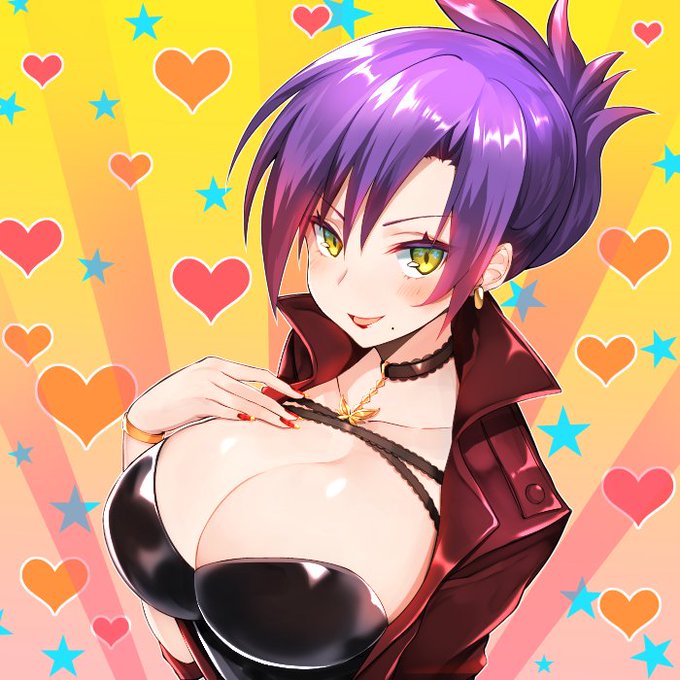
A doodle of a different domme-y outfit design for Kat from early last month got finished up. The high contrast look plays off her red hair really well.
If you like my stuff maybe check out my Patreon.
https://t.co/qHhVjhqktY


Finally I can share my submission for #drawadotjunyawatanabe The S/S18 collection is beautifully balanced with contrasting elements which makes it so exciting! #fashionillustration


Padparapscha so far! now to reword the backgroud, contrasts and details! (I'm still on!)


Gracias Twitter por reproducir mi gif no como otros :'@ djdjdjjsm me gustó mucho como quedó con todo y sus detalles X'3 debo practicar el alto contraste y eso -cry-
>3< lo máximo que había podido hacer era que un pj. Parpadeara y ahora mueve la cabeza qvq
https://t.co/e1Ke8i7xLE


another watercolor commission from a bit ago. Was fun to work on character contrasts


Ok I like bright contrasting paintings I guess. This will be for sale at @EverfreeNW as an 11x17


Tanto bello quanto spietato con i propri personaggi. Criminal è una montagna russa di emozioni e sentimenti contrastanti, di plot twist imprevedibili e donne letali.


Beyond simply representing a picturesque view, Carmichael liked to capture contrast; “Light and Shadow” (1937)


【お仕事告知】4月29日開催の『M3 2018春』で原田ひとみさんのサークル『HoneyContrast』にて頒布される『チチをもげ!』原田ひとみver.のジャケットイラストや収録されているイラストを描かせて頂きました!スペースは『S-10a、b 』です!原田さんのとってもセクシーで元気の出るチチもげ最高です!

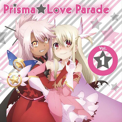
#NowPlaying PARALLEL CONTRAST / イリヤスフィール・フォン・アインツベルン(CV.門脇舞以)&クロエ・フォン・アインツベルン(CV.斎藤千和)


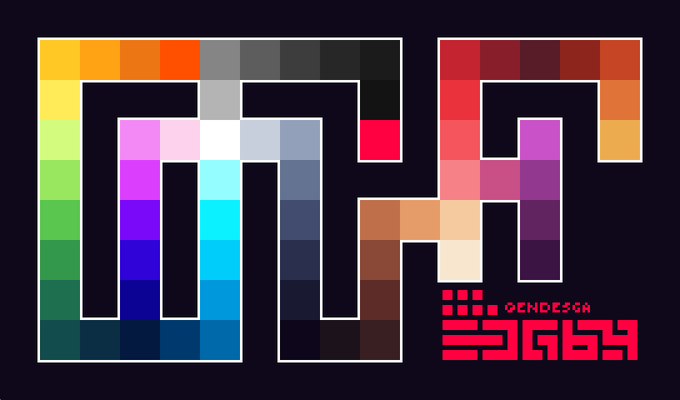
> EDG64 :::.
Honed over years of palette creation, refined for materialistic pixelart and design. High contrast, high saturation, shaped around painting the organic and structured life of the heptaverse - Please RT! ❤️
PNG: https://t.co/vMvS62uilj
ASE: https://t.co/huaiJr6rrO