compareのTwitterイラスト検索結果。 500ページ目


// I mean- she's not supposed to be viewed as a danger herself
She is bratty and spoiled, but in a teasing kind of way
It's her power that is dangerous, since negativity from the hollows is stronk, physically she's weak compared to the average pirate https://t.co/VeSXTAaNw6


My angry bird ocs cuz why not
(Also i made magenta before stella does so pls don't compare her to stella)


Thread!
We now have the official release of Movie 23's dub songs (at least most of them), so lets compare it with last year's release of the Japanese songs, and try to pinpoint what replaced what in the movie (no spoilers!) #anipoke #pokemonmusic
Secrets of the Jungle VS Koko!


Hello guys! Today I wasn’t that lazy so this wasn’t as rushed compared to the last arts I posted. I kinda like it this time!
Day 3 of posting #dailyart
Also looking for more ✨moots✨so comment
Accepting commissions! #commissionsopen #commissionopen #ArtistOnTwitter #arttwt


Compared to last time I think my #ComfortOcs changed XD I’ve been drawing my oc misha a lot as well as Donny ! Dominic is a given and lately I’ve been nailing down lucas and ren’s designs a lot more - I love them 🥺🥺🥺


No.2 was then worked upon. I was able to re-use as much of the original parts as possible compared to No.1.
No.2 returned to the railway to give No.1 help with the growing traffic that year


I used to think that tweaking my model every week was a bad thing, but then I compared the finished model to the first attempt and hoooo boi i'm glad I made those changes!!
like who the hek is this 🤡


@hclawthorne Hes also very small compared to his husband. He turns into a memory stick. Actually he ends up getting so consumed going through his old memories after switching to an alternate uni that it causes him to entirely forget how to function and speak so chromedome always carries him


honestly compared to this, which is from a piece i did a few days ago, it really showcases how me feeling rushed and panicked about my work really dampens my abilities as an artist. i had a realization today that I needed to slow down and rly train my muscle memory


Queria agradecer a todo mundo que compareceu hoje na live e ficou conosco! Em pespecial a @midorimaya666 ,@Alex_G_Art, @DeadlyHetza, @YuumeTheSkunk e @Pyon_Kamuy pelos subs, gifs e bits que simplesmente deixaram deixar sem palavras :O vocês me deixaram bobo e sem jeito +


@ArtHouseGarbage That’s why I like mine so much it’s so clean compared to a lot of them


I got inspired to play around with colors and made this, tbh I really like it! It's super colorful compared to my normal stuff <3
Also, this is my boy Adam XD
#digitalart #clipstudiopaint #originalcharacter

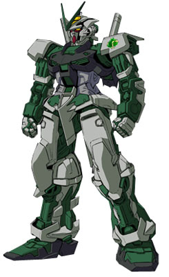

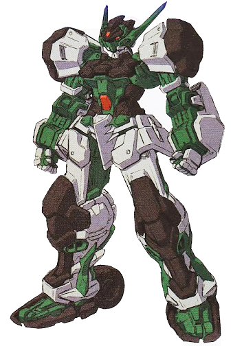
it might not be in SEED canon but i'm fucking glad someone in build fighters made an upgrade to the green frame
okay it's the most basic astray compare to the red frame, blue frame, mirage frame and gold frame but i absolutely love it to death


IRL VS. AVATAR
Holy i am literally an actual normie compared to my vtuber self, i kinda look like im glaring at myself too LOL
vtuber me highkey kind of a cutie tho
⭐️ ima tag⭐️@kitagawaruki and @Shironii1 to do this ay lmaooooo https://t.co/k7TVsFyyq9


@zrayUH Ahhh this is so sweet of you 🥺 Tomorrow will be my 7th day working in a row, then I finally get Wednesday off. Gonna have a pretty decent check for it though (at least compared to what I normally get.) Here's a small handful of kiddos I love and appreciate.


Bueno compares viendo como se acerca mi CUMpleaños el @iaa_G3RS0N_aai quiere hacer un dibujo de los ocs de mis mutuals así que pos pasen owo


Im absolutely losing it on how small Cyndaquil is compared to Chikorita and Totodile. He’s a widdle half pint! ☺️


Okay I know this is absolute shit compared to how I usually draw, but I’m still getting used to Clip Studio Paint and messing around with different brushes and effects.


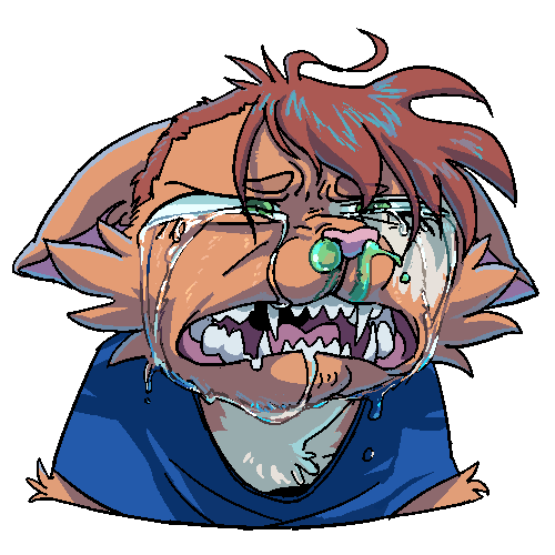
real fun to compare the newer ones to what teeth or tears icons used to look like