𝕶𝖆𝖎𝖓𝖊さんのイラストまとめ
@AbsoluteEngineFollow @AbsoluteEngineさんをフォローする
フォロー数:56 フォロワー数:865


They should've gone with the Spider-Man PS4 Collector's Edition approach for the box art because the logo alone would be so much more effective.


Really? This is what we're getting? Is this entire series' box art just gonna be the Spider-Man equivalent of "serious man holding a gun"? At least the pose is better, but it doesn't pop out as much as the PS4 one.
There's better ways to make simple but eye-catching box art. https://t.co/wf1kIuNWhe


As a kid, I thought Dragonite was supposed to be the female version of Charizard or something. I was pretty confused by its existence.
Now I'm just not a big fan of how drastically different it is from its first two forms. It could've at least kept the blue, I think.

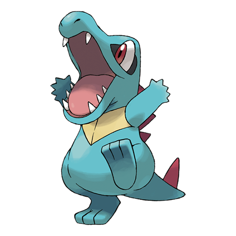
Ordile: "When it bites with its massive and powerful jaws, it shakes its head and savagely tears its victim up."
Jesus.

The suit is great, but not under Bagley's pen and discrediting it for having inverse colors like Spidercide is weak.
Bagley didn't even have Spidercide in mind when he came up with it. https://t.co/rYC95fPVSi


When you realize that the sons of Carnage and Venom are never going to meet and be bros as the first two spawns who weren't corrupted by their human hosts.

@budakai93 I can at least see the logic behind that looking like an apple. Plenty of animals and insects mimic the appearance of something else for one reason or another.
You're not gonna find an animal that has evolved to mimic a fashion style nor would it be beneficial.