
Atlas Talos (he/him)🏳️🌈さんのイラストまとめ
@AtlasTalosFollow @AtlasTalosさんをフォローする
Branding, comics, design, illustration.
Artist on My Boyfriend Is A Shark (@mbfias).
フォロー数:384 フォロワー数:728


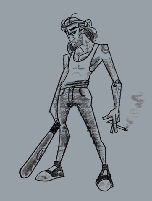
I skipped a few process screenshots along the way, but basically you can see how the structure work I did before feeds right into the clean finished product, and the motion lines are still obvious.

chuck: atlas, will you draw me something bee-yoo-tiful on your ipad?
me (mascara running down my cheeks): ANYTHING YOU WANT YOU PERFECT ANGEL
chuck: a cat next to a scratching post
me (dabbing my eyes with my hanky): ok


Quote retweet with your pink and purple art!❤️💜 https://t.co/idsm83loGJ


since i've decided to go painterly with it, next step is to figure out which brushes i want to use! i've evangelized about the brushes my art role model @FRENDEN sells for Clip Studio -- hundreds of different brushes sold at a super reasonable price.
over the last few weeks i've been working on developing the style i want to go with for a collaboration i'm working on with @RansdellLiz. it's all about pushing it, streamlining, not settling for your first idea. like editing a manuscript, you just keep tightening it.

That business name, which is great on so many levels, is immediately evocative to me of classic tourist postcards. while this is possibly the obvious choice, I'd be remiss if I didn't take a crack at it.
So this is design #1. I made sure to integrate a crystal for branding.


here's how my weekend was spent. it's fun bouncing between such different styles