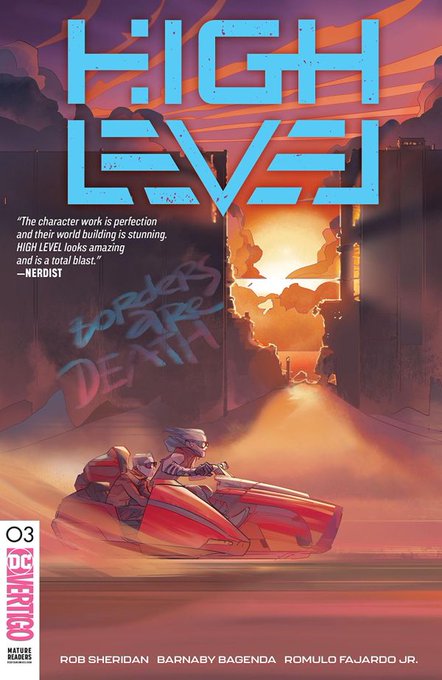
Out today and lettered by Blambot: FIGHT CLUB III #3, UMBRELLA ACADEMY: HOTEL OBLIVION #6, ALIEN III #5, HOUSE OF PENANCE Library Edition HC, and DRAGON AGE: DECEPTION HC...all from @DarkHorseComics!
NEW VIDEO: Butting Balloons Against Panel Borders. https://t.co/dhHEh9ns2F #comics #lettering #tips #blambot
Balloon tail widths, where they meet the balloon, should always be consistent. Here's how I do that: When I add tails (pic 1), I make sure the "fat end," where it touches the balloon, is about the same width as the letter-height of my dialogue font (pics 2&3). #lettering #comics
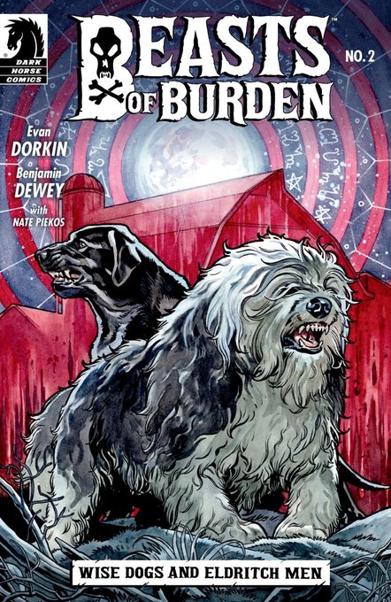
Out today and lettered by @blambot: STRANGER THINGS #1, and BEASTS OF BURDEN: WISE DOGS & ELDRITCH MEN #2. Both from @DarkHorseComics.
Blambot Font of the Day: Beelzebrush BB #blambot #font #comics #bfotd https://t.co/ZqLk1ptqxI
Out today and lettered by @blambot: DOCTOR STAR #1 (DH), and I HATE FAIRYLAND #17 (I). I want to express a personal thanks to @DarkHorseComics and editor @NotTooChaby for including the letterer in the cover credits of Doctor Star! I couldn't be happier about that.
Adding a slight calligraphic stroke (bottom) instead of the default uniform stroke (top) to the outline, or offset path of a SFX can go a long way to making your effects more organic. Open up this graphic and notice it’s not just the weight of the black, but the irregularity.


