122 件中 61〜70件を表示
So I have two designs of the main logo (which I may redo because the rose by the plume doesn't look like a rose, more like a lilac flower)
Left is with vector lines, right is my usual smooth lines. Which one looks better?
0
2
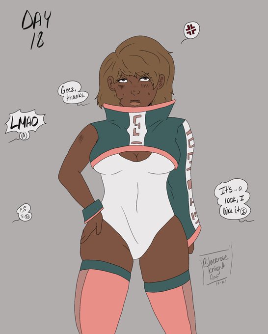
Day 18
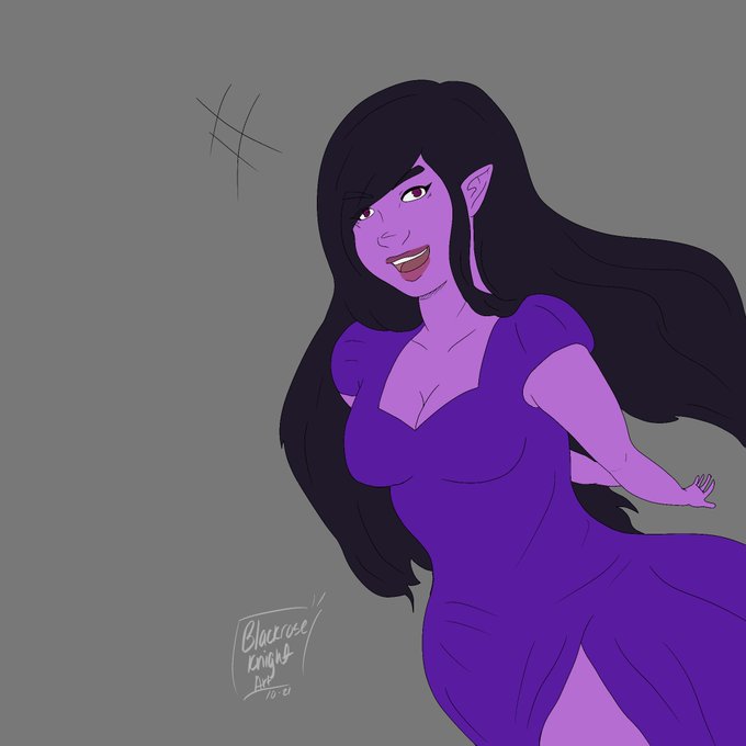
To be fair, it’s kinda cute. She is an unnamed OC from a Hellsing hyperfixation I had years ago (still do lmao). I might name her Elizabeth, maybe.
0
0
Day 18: Ballet
Dancing takes your mind off stressful things.
0
0
Day 16
There really wasn’t a prompt for this one so I just drew the mascot lady lmao
0
0
Day 15
Rukia debuts this cute fit~ (I do get nun vibes from it and I wish I drew her wearing a habit)
0
2


