71 件中 31〜40件を表示
Virginia: I can't believe Caesar's fuckin dead. Nice vine pattern. Still a seal-on-blue. C+
Washington: Unimaginative, but concise. Could have used a better shade of green. B-
0
0
Minnesota: Christ it's hard to see what's going on here. F
Mississippi: A very good replacement to the old one. Well balanced. Leading the way with actually designing good flags. A-
0
1
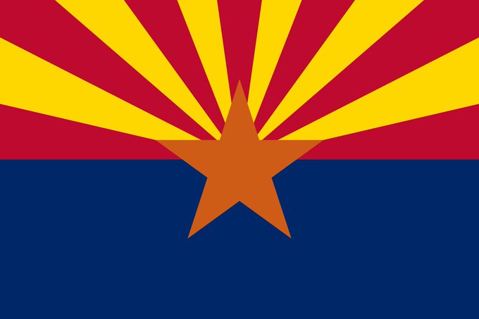
Arizona: The blue is way too prominent and that orange is hideous. C-
Arkansas: Welcome to Las Vegarkansas. They do represent the stars fairly uniquely, if somewhat confederate. C
California: Big Bear is watching you. Good color balance, though a bit white. B
0
0


