Now I wanna talk about creatures/monsters. This one is tricky, and it definitely took me a while to fully grasp, as humans and creatures are two totally different things. But honestly, the same principles still apply here. Just more stylized realism.
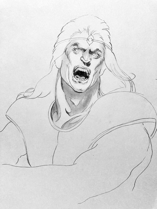
Here’s some examples of faces that aren’t as feminine. Again, notice how a lot of these have less pronounced eyebrows and eyelashes. Shading also plays a huge part in how these look.
This is something I took into account when drawing Christopher Belmont. He is especially known for being a more “chadly, macho” character. The typical feminine face just wouldn’t work for him. Thus he has a stronger jawline, and less pronounced eyes and eyebrows.
A good example comes from Simon Belmont. In Castlevania Chronicles, Kojima gave Simon a very drastic redesign. Giving him a very feminine facial structure, red hair, and fur/leather attire. Most people tend not to like this design since it doesn’t fit the “macho” nature of Simon.
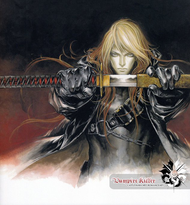
One common thing I hear about Kojima’s art style is that she has “same face syndrome” with a lot of her characters. And while I mostly agree, I feel like it’s a disingenuous statement. Kojima has drawn a myriad of characters with very unique faces.
The most stylized features obviously being the face. You can easily tell an Ayami Kojima piece just by looking at the eyes, eyebrows, nose, and lips. But more importantly the shading. Ayami Kojima often tends to shade things with the light source coming from directly in front.
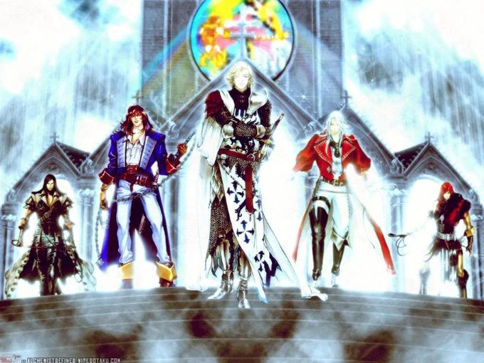
Hell, even looking at fanart, we can see that this is the case. Often times I see people drawing these “Belmont reunion” fan arts, depicting all the Belmonts together. But more often than not, Christopher is left out.
Then came Castlevania II: Belmont’s Revenge which released in 1991. This game tends to be received much better due to its more fluid gameplay and stage design. This was also the game in which we meet Soleil Belmont, the son of Christopher, as an antagonist.


