@HassanOE 4 more examples:
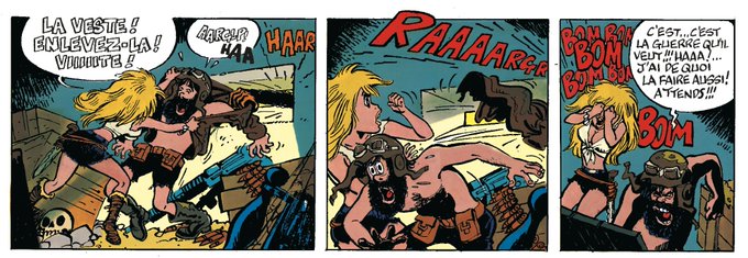
Peyo: Johan et Pirluit, La Flûte à six schtroumpfs
Walthery: Natacha, l'île d'outre-munde
Franquin: Spirou, les petits formats!
@nobfactory: Les souvenirs de Mamette 3. La bonne étoile (I really love Mamette)
All from BD for kids or early teens.
Sometimes, when I adapt from another language to Spanish, I have to change the original art.
There's an example of one of my latest gigs.
#comiclettering #comic #bd #Retouching
@JamesFerguson @LetteringBear I don’t have a comic but two comic fonts families in “pay what you want” if you are interested 😊
Fonteys (https://t.co/W5xzrEvwXk)
Fumetto (https://t.co/elPmtb68he)
@DarkoLafuente @GermanGarciaArt @DMPguionista Ay…
No habramos el melón de las “adaptaciones gráficas”, ya sean yankis, o peor, de aquí
So, back to tradition, that's easier in all caps than in lower case.
But it can be achieve in lower case as well. Nowadays in the indy comic scene, especially in the European comics, & more and more in the mainstream comics artists are using lower cases for lettering BUT ->
Again, All Caps is tradition. The first comics was lettered that way. Probably because capital letters are faster to write and because they allow less space between the lines. So more text was put in less space.
Images from "Krazy Cat" & "Little Nemo in Slumberland" ->


