256 件中 31〜40件を表示
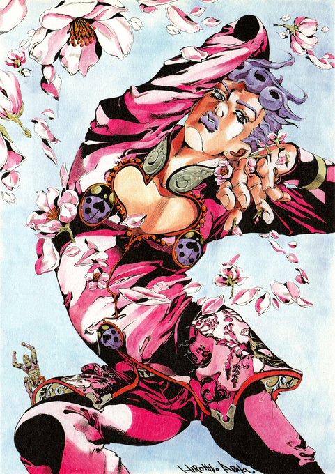
@voolingeveryday @MasterMatt64 @HamonBeat Fine? I mean yeah Araki's art is good but that font looks so tacky, it's a literal newspaper font. Where's the stylisation like the JP volume has? Better yet, you compare it to other Languages and it looks even worse in comparison
0
1
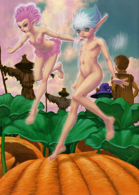
@wdieljpg @BerserkArtDaily These are the only pieces of the art I've got (TCG BK5 05)
0
6
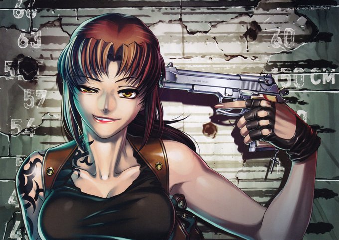
Hiroe should drawn more fashion, these look so much better than the usual swimsuit stuff he does https://t.co/bTgkZwQ0ue
0
2


