
Grits + Gridsさんのイラストまとめ
@GritsGridsFollow @GritsGridsさんをフォローする
フォロー数:912 フォロワー数:1090

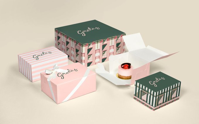

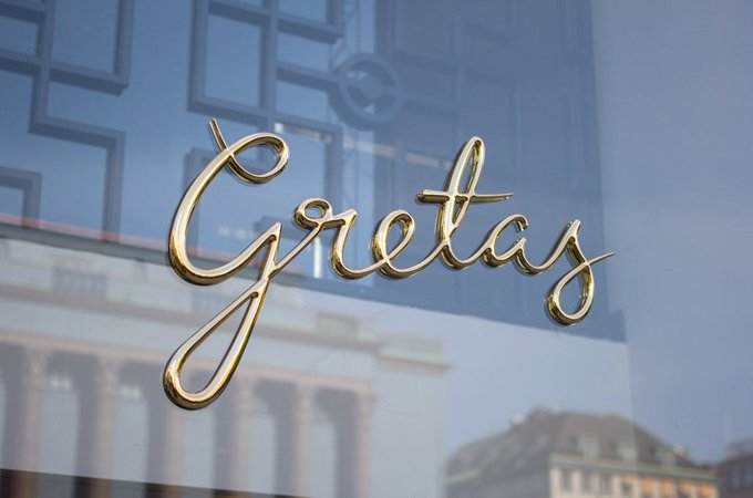
The identity for Gretas is based around an illustration that @25ah created of the building it calls home; it’s cropped interestingly to create a unique architectural pattern on each piece of collateral. https://t.co/OxUemRc9t7


Mordis&Co is a restaurant in Barcelona, where you can choose from a selection of healthy salads and sandwiches. For the name and visual identity, Roser Padres played with the idea of the ‘moridsco’, or nibble in Spanish.


14 Cannon's latest limited-run brew owns the photoshop madness of the 90s and dials it to 11. A daring stand against can design minimalism, this IPA's tidal wave of typography, colors, and metal imagery stands out from others with pure visual mayhem.
By @longodesignsinc


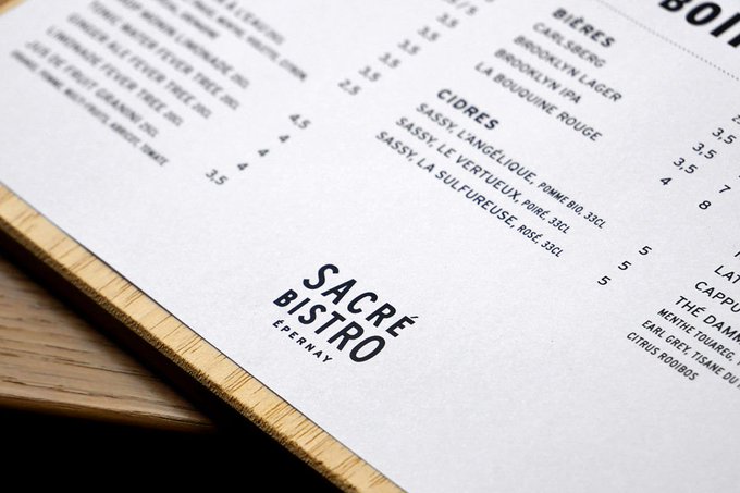
The logo for Sacré Bistro is inspired by the corner facade of the restaurant's building. Expressive, elegant type makes up the bulk of the visual language and is used strikingly across the menu system. Restaurant Branding & Menu Design by @studioplastac. https://t.co/8kBBIoxiUm


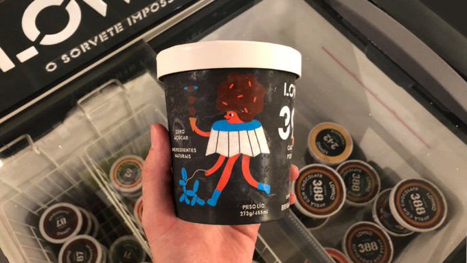
Illustrator Henri Campea created a darling set of character illustrations for Brazillian ice cream brand LOWKO, personifying each of the flavors on the packaging. https://t.co/u7Mivs6HV1


Like the full moon shining into a lush jungle, Purnima (whose name means full moon in Hindi) is dark, mysterious, and refined. Purnima Branding & Print Design by Ele&Uve. https://t.co/5LCAM8TSH2


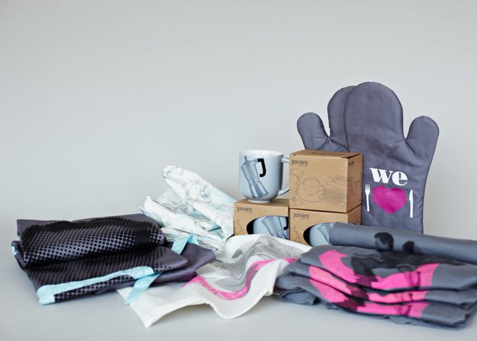

We don't often share celebrity-chef restaurants here on GXG, but we'll make an exception for the warm, colorful and casual branding and interiors of Jamie's Italian. Jamies Italian Branding, Interior Direction and Art Direction by @ThePlantLondon. https://t.co/pDf5OQzPdP


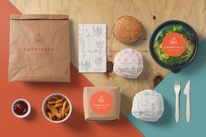
Usually when you see burger brands, they are large and in charge, brightly colored and bold. Carnivale takes a softer more organic approach but doesn’t lack in personality. Carnivale Branding & Illustration by Matilda van der Walt. https://t.co/6qcZMOhqwU


Can wine in a can be repositioned as a quality product? @Hyperquake worked with Wine Society to change perceptions of non-bottled wine into a premium product and to develop a brand that leads with clever copy, intrigue, and beautifully minimal design. https://t.co/Gm1obkp4fH

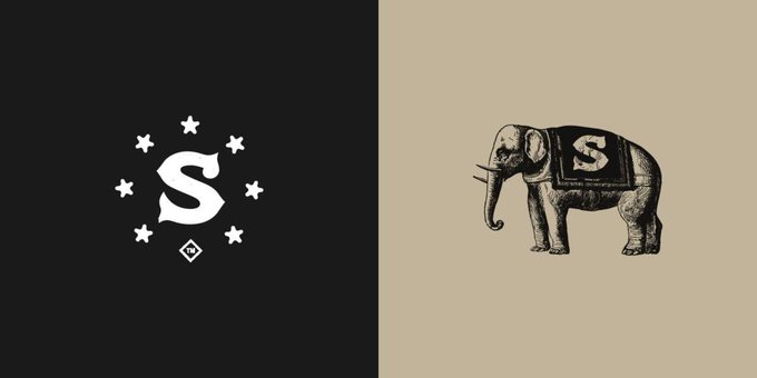
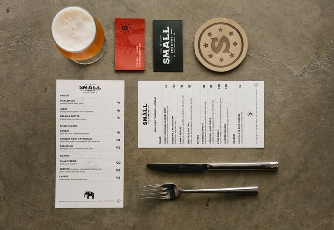

Small Brewpub was born out of a close-knit community of brewers, craftsmen, and food enthusiasts. They embrace the imperfections of hand-set type in a way that speaks to the founders’ passion for woodworking & their attention to detail. By @studiomast https://t.co/gyP0NtqEF4