Tips from Jesse Hammさんのイラストまとめ
@Hamm_TipsFollow @Hamm_Tipsさんをフォローする
フォロー数:4 フォロワー数:18104


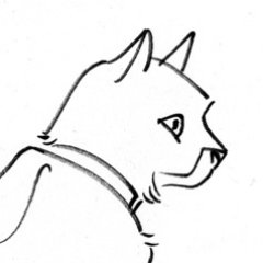
Drawing it quickly gives you a smoother, more dynamic line than drawing it slowly/carefully.
Drawing on a new layer allows you to adjust it and erase the excess without interfering with your other lines.
Avoiding the ellipse/circle tool is faster and looks more organic.
(2/2)

Notice, though, that Panel 2 is necessary as a bridging panel, to prevent the shift in point-of-view from being too abrubt. Without that bridge between Panels 1 and 3, the car would appear to veer in a new direction.


Cartoonists are often advised to move action from left to right, but here Leo Romero finds an exception to that rule. Had the car aimed rightward in Panel 1, it would appear to stop in P3 (images 1-2). Instead, Romero aims it left in P1, granting it momentum in P3 (images 3-4).


When limbs cross behind other body parts, artists often draw them backward or upside-down, because we forget how the limb attaches to the body. Avoid this by acting out the pose yourself when drawing parts that are partly occluded. Where's your thumb, your palm, your big toe?


Check out my latest #CarouselColumn, where I share tips on drawing ANIMALS!
https://t.co/CyT5ybH7zw


Most of them! Here are a couple of old favorites: https://t.co/jC8SJtd2li


Here are some examples (lettering, not balloons). I prefer Moebius and Toth lettering their own work (left); it feels more organic than the rather sterile letters added by someone else (right). There are similar cases for balloon design, but I don't have any handy. https://t.co/hQJim98Xt8


Generally, wide panels signify longer periods of time; slim panels signify briefer moments — as Miller shows in this Daredevil page.
With gutters, you can signify a pause with a wide gutter. Or, speed things up by overlapping (as I did in these panels from The Blessed Machine). https://t.co/i78mGFBxEW

“Every so often you have to bring on the elephants.” ~Hal Foster, on the need for occasional spectacle