
Lewtwoさんのイラストまとめ
@LewchubeFollow @Lewchubeさんをフォローする
🟥 youtube.com/@LewtwoYT
🟦 discord.gg/hSxbtAV
🟧 ko-fi.com/Lewtwo
フォロー数:2961 フォロワー数:74712


@B_Kurayami3 so one big thing that'll make your work less flat is through shading, this artist specifically seems to use a mixture of hard and soft highlights/shadows
circled are hard highlights, where light is bouncing off the skin/clothes etc.

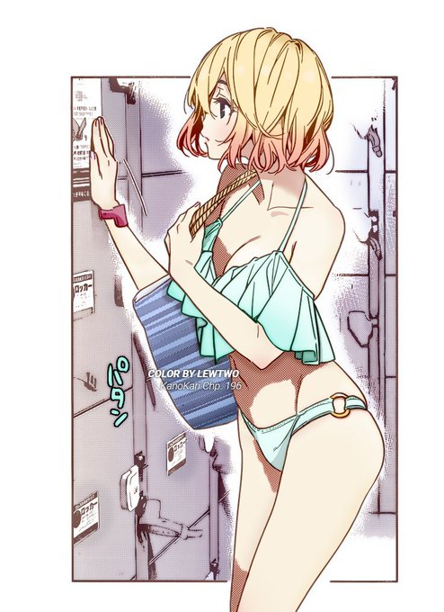

the plan is in motion #彼女お借りします
🔴 More Manga Recolors --> https://t.co/hWcLmGu0A0
🟠 Support me here! 🙇♂️ --> https://t.co/Sfb9GTOIRK
📨 DM for paid requests!

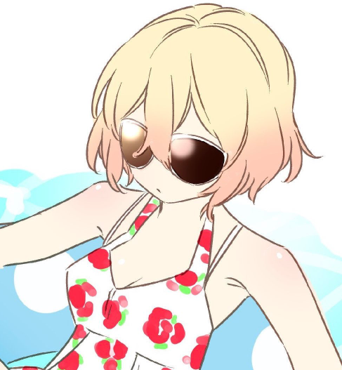


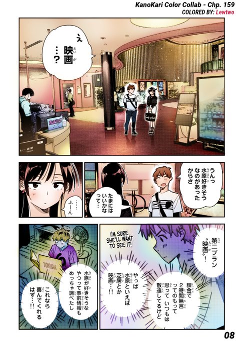
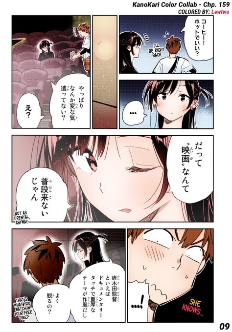
The full-color collab we released earlier today to celebrate the 4th Anniversary of KanoKari obviously had a chunk done by myself.
#彼女お借りします連載記念祭
Here are my individual contributions and some design insight in this thread!


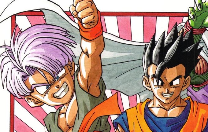
@TheFantasticIan it’s funny because Dragon Ball used highlights effectively for a long time, mainly through Nakatsuru or even Toriyama himself
Yamamuro just used them very improperly and made each character look like a toy, combined with his typical poor linework and colour choices