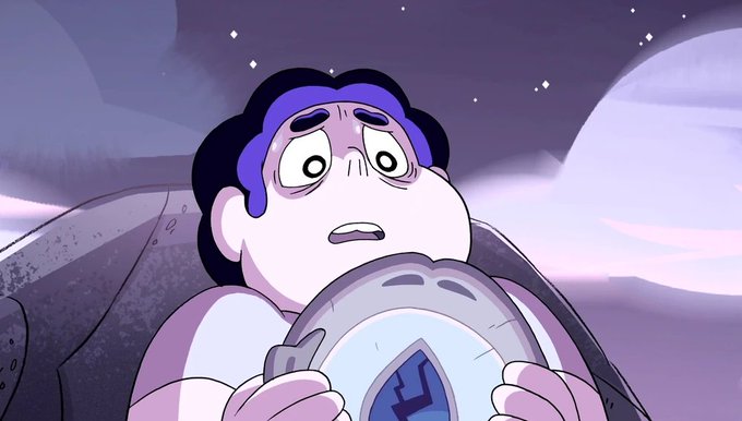
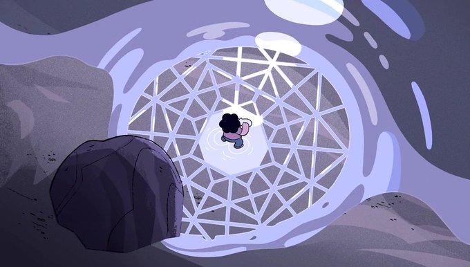
this show had like, REALLY good build-up early on. mirror gem in particular does an outstanding job at creating a sense of eerie mystery, hinting to a world much much much bigger than steven's narrow pov.
say what you will about how it turned out, but this definitely hooked me in https://t.co/FdBP0hcldS
@nescartridges i'm probably going to sound insane but this is exactly my issue with modern velma's look
OUT OF DESPERATION, I WILL NOW MAKE YOU A 3D CHARACTER MODEL FOR VRCHAT (OR JUST PERSONAL USE) FOR $200!!
I NEED CHRISTMAS GIFT MONEY PLEASE
FIRST HALF OF COMM WOULD BE PAID UPFRONT ($100), PLEASE DM SOON!!! AAAAAAA https://t.co/Ao89nNtbSN
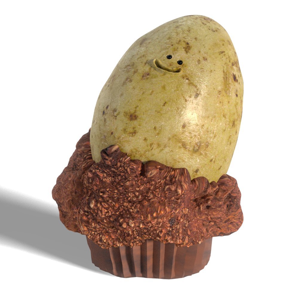
a bit of #mudbox practice from today, featuring an angery ruby
#stevenuniverse
@ManiacXVII a large part of why the sonic and elise thing is so off-putting is because it's pairing a stylized cartoon with an uncanny attempt at a realistic human. aesthetically, they don't mesh at ALL.
topaz is much more stylized, which helps her look much better when put next to rouge.
@TF2Emporium the topology is pretty bad, i think. the lenses aren't properly centered within the rims of the glasses, and the temples look too wobbly.
the rims also look too thin, creating thin lines that don't mesh well with tf2's style. medic's default glasses already nails this.
@queascolavida15 not sure if it's broken there, but even with it fully assembled it still looks horrific
there must be some next level incompetence from the animatronics dept here if they really put the pieces together and thought "yeah this definitely won't make a child shit his pants"
@shypley this is easily the worst out of the four for me, though. the others i can kinda understand but there is NO universe where this beak would invoke anything but fear from a child lol


