
GAZE!!!!!!!さんのイラストまとめ
@ShinyGazeFollow @ShinyGazeさんをフォローする
フォロー数:515 フォロワー数:450


Only picking ongoing stuff here and I’m sure I’d have completely different answers on another day. https://t.co/4sCVDAea5w


Just taking a random OP panel for comparison as it’s the one people cite most next to Jojo but how do you not see that the contrast is fundamentally a part of the composition of a panel. Having fully coloured characters talking in an empty void is just a weird nightmare to read.
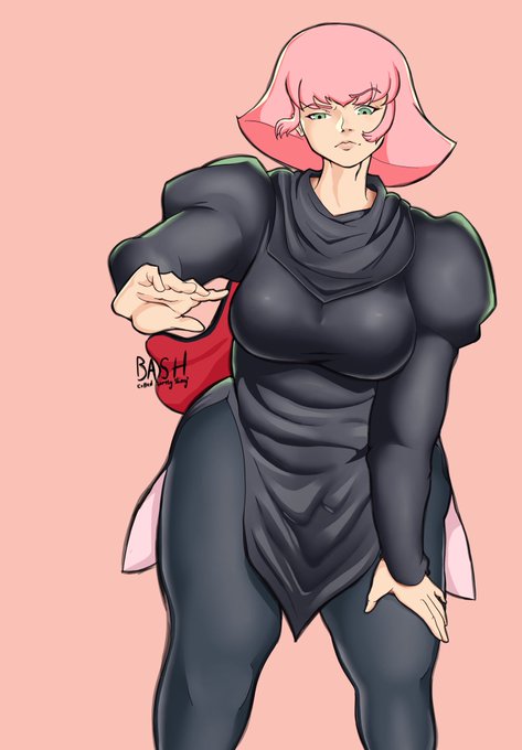
Been kinda dissatisfied with some of the art I’ve been making that I didn’t post but I’m incredibly pleased with how this Haman Karn piece came out. Zeta Gundam designs are so sick.
I’ve done a lot of Zeta Gundam fanart but I always struggle with Fa’s hair. Really happy with how this one turned out despite how hard the perspective was.


Nia from Xenoblade Chronicles 2
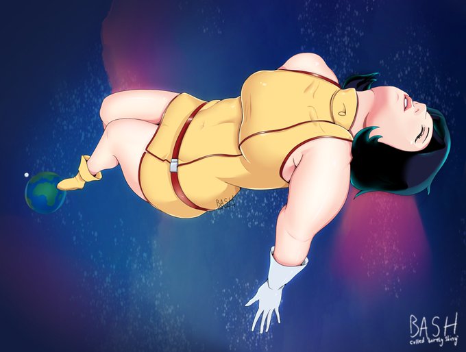
This one took a lot of effort in the end. Went with way flatter shading but I think it was the right call here.


