@fictionalsarah No Problem! I just remembered that the good folks at "Manga In Libraries" did a rec list with ages! I'd rec "My Love Mix Up" and "Kageki Shojo" but start with Vol 1 not "Curtain Rises" as that Vol was penned for 16+https://t.co/vUb0ve8PEk
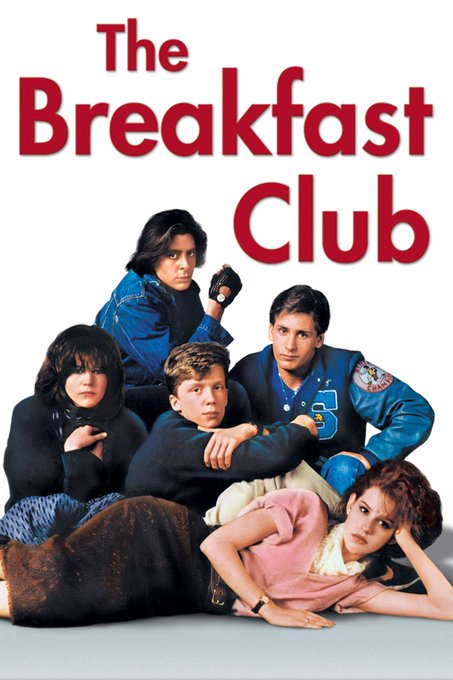
I'm catching up on Akane-banashi and I honestly don't know what to do with the fact that a Manga about the traditional art of Japanese Theatre is actively parodying an 80s American Teen Comedy/Drama?
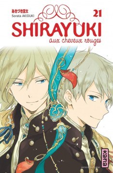
@rinreadsmanga Omg that would be so good!!! Their magazine covers are always SO BEAUTIFUL! I mean, it's fun to see how different nations rise to the design challenge for the square covers, but COME ON! Full page would be so awesome! I just want extra pretty...
Oh! No wait this is interesting. HanaYume HAVE rolled out their new brand type to LaLa books too? Just not Natsume's Book, Snow White or Baby Sitters? "Last Game" (2011-16) got updated midway though. Reverse X Rebirth (2019-21) & Meteor Prince (2013-14) had it from the start.
It's also interesting that this seems to be a thing to Shojo Publishers over Shonen? Jump and related titles have always looked distinct beyond their logo.
I do find it interesting that they HAVE actually had some change to their layout rules by only insisting on the small tag banner rather than a whole bounding box in recent years -- but it seems to only apply to mainline HanaYume books and not things from LaLa and the like?
How could this image exist and nobody told me about it? How was this not all over my dashboard? I'm -- Kodansha. Please. Release an English Version I will give you all my money.
*gentle sobbing* whhhyyyyy? (I know climate change but also whhyyyyyyy?!?!)
Like, why keep Krypto and Ace and then change everyone else??? Krypto and Ace were in the 00s Cartoon so have a little more recognition but then so would Streaky! BUT THEY HAVE NO STREAKY!!!
Also Bat Cow. Bat Cow should be in this, surely she's earned it by now???


