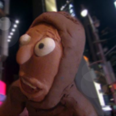
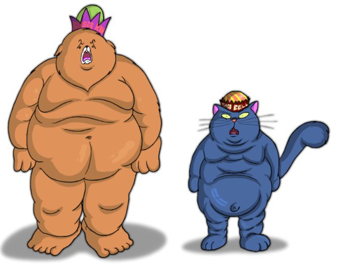
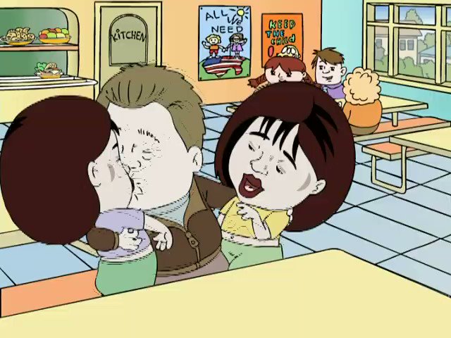
2014 vs. 2018
Some people might argue that they prefer it when it was more detailed, but the reason it was even so hyper-detailed was because if you don't do that in Flash, it'll look like shit.
With traditional art, it looks much more simple and charming.
Really old drawings of them- This is from like 2014, and that drawing there from Brendon is actually from 2012 (that was the first ever drawing of him), he's really that old already.
I'd say that Adel pretty much looks the same apart that he's drawn in Flash here.
I honestly think that in this episode alone, he is more horrible than Cartman in all of South Park history combined. That's what I was going for too! My goal is that he'll make Cartman look like a lightweight.
What a Goofy Guy! Right?
People say South Park looks more advanced than ever now, but that's not true. It just look detailed for the sake of being detailed. S10/11 are the best looking seasons.
S10 and 11 look way better than the show does now. This looks like it could be from a 2nd South Park movie.
A sketch from the first episode - this is supposed to be from a love montage with Henry and Donna.
I managed to find the old swf. of this scene and exported it in lossless quality. It's weird to see it in such crisp quality and audio (yes, I know the audio is still shit, but it's slightly better than the original upload).
From the cancelled 2012 pilot vs. 2016/now.
It's surreal for me to think that what almost became the pilot that defines the show doesn't even have Henry or Brendon in it. I also moaned about how hard it was to make, I could make that shit in like a week now. Lmao.


