can sonic origins be like namco museum
I'd buy 50 copies for that
https://t.co/f9E7AEBApW
(the actual thing is pretty messy but it works for the icon resolution lol; might expand it for a custom Steam cover, idk)
@keithjohnstack I technically beat Chaotix 100%, but I was using save states so naaaaaahhh
as for Lost World, 2013 Tracker had too much time on his hands or something
tonight my girlfriend @halseeyon taught me a painful lesson in exchanging money with idols
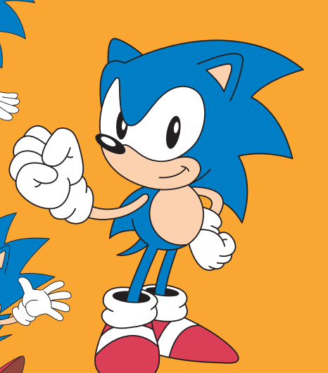
@Dandy_Kaiju these are actually both from the same style guide! I do agree that the second one looks worse, but thankfully they've mostly stuck with the first one (including when it was shaded for Sonic Mania)
Modern Sonic gets away with it more often because they were always made with vector in mind, but they still made flat shaded pieces for reference with him too; it's also likely where the 'simplified' shading style many pieces during the 2000s had came from (such as the 3rd image)
LRT: sometimes SEGA even has multiple remakes of very similar art lol
vector art is much easier to apply to a range of products and such; example I always think is if I need to put Sonic on the side of a skyscraper, a vector would cut it much better than 1000x1000 airbrushed art


