Twiins iinkさんのイラストまとめ
@Twiins_iinkFollow @Twiins_iinkさんをフォローする
Twitch: twitch.tv/twiinsiink
YT: youtube.com/@twiinsiink
フォロー数:37 フォロワー数:1770


I saw fatmanfalling do this and it seemed like fun https://t.co/TIQEaZL3GH

In 30 minutes I'm jumping onto stream to do a husbando tier list!
Even if you don't really know about Hypnosis mic, drop on by to hear me blabber about rap and character design anyway! lol
https://t.co/lnXTreHwOP

Patrons have access to a new video! It's a nitpick corner, but this time it's longer than 4 minutes! :D
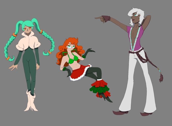
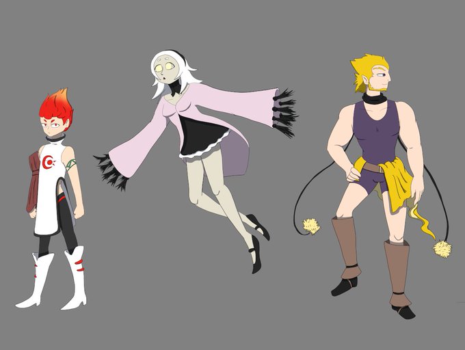
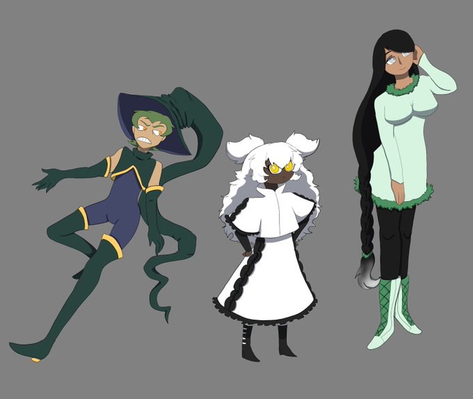
Thinkin 'bout character design.
(They aren't grouped in any specific way, my giga brain decided to make an image 12,600 pixels long, and twitter didn't like that. So I had to cut it up)

Chapter 4 of my webcomic is finally done and available to read (link in the reply cuz twitter's a weirdo about links)!
I hope you like it, and sorry for such a long wait! 😀


I've got some new emotes available over on twitch! I admit that they could be better (they're a little to intricate for the small size) but for a first batch of emotes they could also definitely be worse!
(I've also got some animated ones getting approved!)

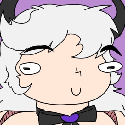
No longer am I gunna be wide-Oscar in the corner of my streams! Now I've got this fancy new look to represent me as I cry while playing pokemon games!

In 1 hour we're jumping back into Pokemon Rescue Team! I've been leveling up Team Bonkers and I think there's a good chance we'll be finishing the game today! So swing on by!
https://t.co/lnXTreHwOP