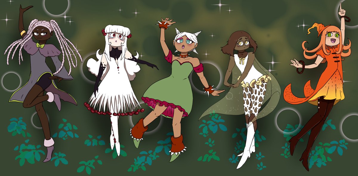
Here's the Madoka Magica teams we came up with on stream! Thanks for all the help, Spriinkles!
In 10 minutes we're giving the Magical Quintet Pokemon teams!
https://t.co/lnXTreZG2X
iink has a new plant friend, Roseberry! And I want to challenge all you to see how you would design him as a human! Use #newiinkplant (make sure to remember there are 2 i's lol) to submit your designs! The final day for submissions is June 30th. Don't be afraid to @ me as well!
Here are the magical girls from stream! Left to right we have
Black Bat Flower, Bleeding Tooth Mushroom, Prickly Pear Cactus, Veiled Lady Mushroom, and Tiger Lily!
Thanks for joining me, spriinkles!
What I learned in boating school today is
that I can export stream VODs directly to Youtube without having to go through the effort of downloading the VOD, and subsequently uploading the VOD to youtube manually...
We gave all the project sekai characters partner pokemon on stream today. Thanks for the help, spriinkles!
No stream today because Dumb Adult BS (TM) happened. Hopefully tomorrow fares a bit better!
In 15 minutes I'm doing a Fashion Battle over on twitch! Who has the better drip, Hypnosi Mic or Paradox Live? Come find out!
https://t.co/lnXTreZG2X
I made a song! And Patrons can listen to it right now! I hope you look forward for when I make an MV for it and release it for everyone to see :)


