@sadiosaurus Absolute game changer that one...
Same for the lighting, I use an orange or a green/yellow on mode Add at a really low opacity to give the first source of light and then build on that with a gold, another pink layer for flushed cheeks, end up with 3 or 4 shadow & lighting layers
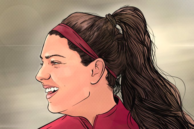
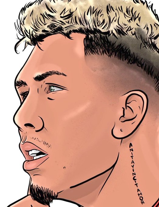
@ZB_CREATIVE (2/2) Longer hair follows the same rules, if you can't see the hair line (Xabi) start at the sideburns and work your way to the fringe, remembering the hair will be thinner where the light hits/shines through but partings & longer hair is all about flow and following the lines
I'm still nowhere near the level want to be as an illustrator, where I am now is the best I've ever been, but not the best I'll ever be, the only way to get better is to practice, set goals, tasks, projects, challenges, watch others, listen, be quick, be slow, be loose, be tight
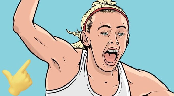
I also like to over exaggerate lines, forearms and shoulders I like to bring attention to the muscle, knowing how a body part works (look at your own arm or leg for reference) can really help bring body parts to life...
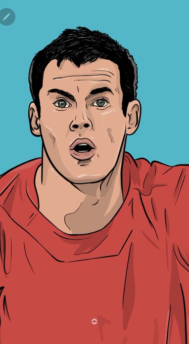
As above, eyeballs [unless on an acute angle] are 99% a round iris with a pupil & colour, I'm often guilty for making the iris solid black on full body or badge commissions as the final product won't pick up the colour but they ALWAYS have the white spot to bring them to life
Things like ears, eyelashes/brows, nostrils are 99% of the time anatomically the same in everyone, so if it doesn't look like an ear, you've probably done it wrong, yes they're different shapes but unless it's a UFC fighter with cauliflower ears, they should follow the same laws
Experiment with your brush settings, the stability, pressure you use, be free & try to really look at the reference
Often our eyes are tricked by shadows & nuisances in the face but your brain should tell you what's missing, try to draw the lines you can't see at times
2) If you're shading skin, try to use a dark red for shadows rather than black on mode multiply, this should give a warmer feel & more human
If you're on Procreate, learn how to clipping mask, alpha lock, reference and experiment with the blend modes (add, overlay, multiply)
@CFCIllustrated @davewi11 @midjourney_ai Granted this thing Dave's chucked out is "alright" for what it is, but I've not seen anything yet that's acceptable to replace real art, it has no soul, no passion, everyone looks dead or "lifeless" of they look human at all, I honestly think it sucks


