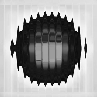
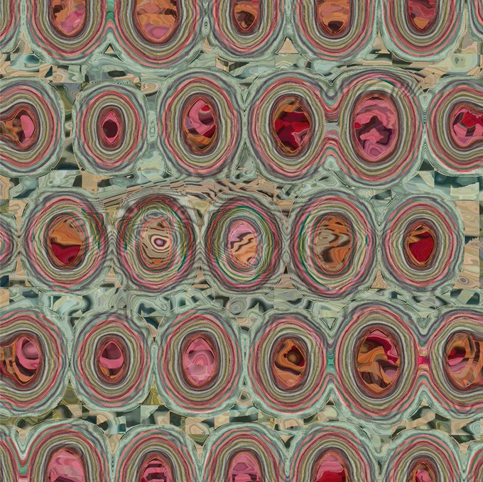
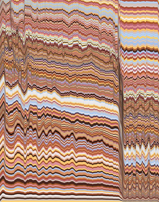
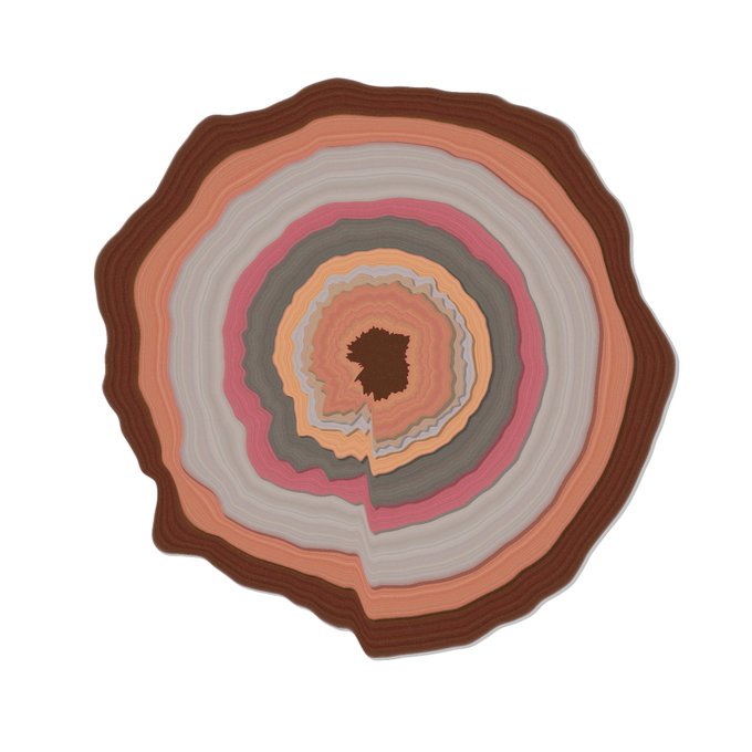
Here are some artifacts from making my friend's #generative tree ring wedding gift. The horizontal layering was me figuring out how best to visually handle the frequency spectrum chunks. The original vision was for the rings but I almost gave up and went with the stacks.
I made this wedding gift for my lovely friends. I sampled each word of the intro of their wedding song, calculated the frequency spectrum of each sample, and plotted each spectrum in polar coordinates. The tree rings symbolize growth despite the ebbs and flows of marriage.
These are zoomed in parts of a commission that fell through. I've sampled multiple vintage data visualizations to get multiple color palettes (sooo hipster). This is the first time I combined them. It was fun to work with a focus instead of the normal meandering exploration.
I was brainstorming a new project which will involve manipulating points around a rectangle. I already wrote some code to do that back when I made these little buggies. Couldn't resist running the old code and seeing some new #generative creatures come to life!
Here's some failed experiments to show you that making artwork is not all roses. The great Chuck Jones said it best: "Every artist has thousands of bad drawings in them and the only way to get rid of them is to draw them out." #degenerative
Lately I've been inspired by the work of Julio Le Parc. They painted Mutación de Formas in 1959, and I just love it. The first image here is my #generative reproduction using Python in #Processing, the second image is the original painting. Source code: https://t.co/XwPTNJ5AxM
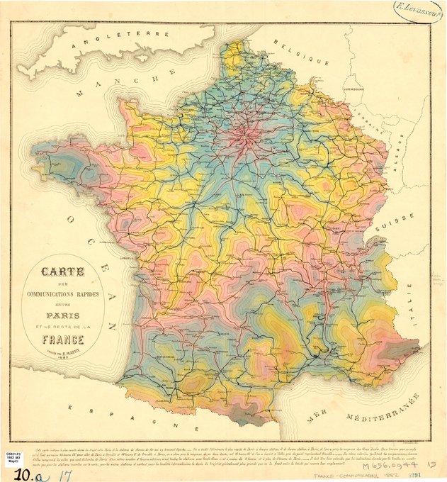
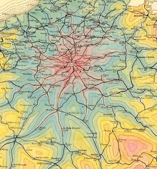
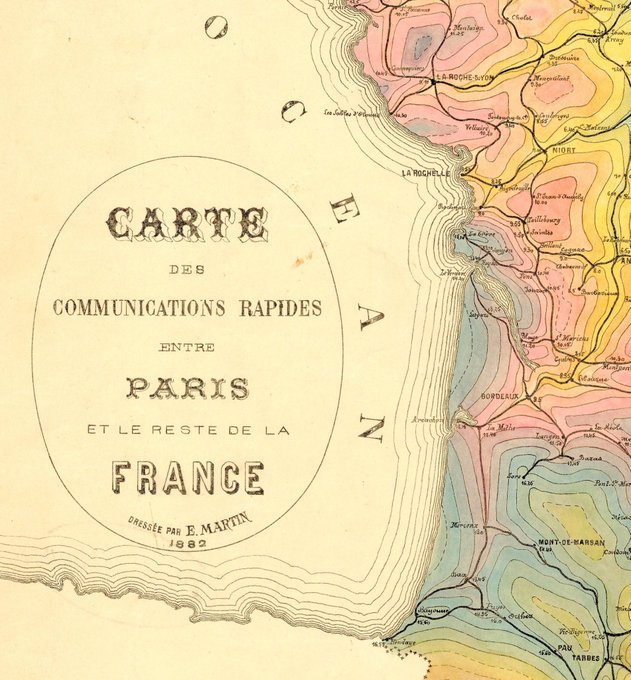
This is my new favorite French #map. Found this one in the University of Chicago map collection. The color choices are not what I expected from a #datavisualization made in 1882, but I'm here for it. This shows the travel times from Paris radiating out into the country.
