Bad Design Podcastさんのイラストまとめ
@badesignpodcastFollow @badesignpodcastさんをフォローする
🎨 💻 🎙
linktr.ee/badesignpodcastフォロー数:1776 フォロワー数:3616
16 件中 1〜10件を表示


Marvel movie posters have been very hit or miss and this feels like a miss. Sizing of the background elements feels off, lacks depth and the environmental lighting is all over the place.
0
19


People are debating Spider Man 3 and the Dark Knight Rises but really we should be debating which poster was better. Both are goated
2
26

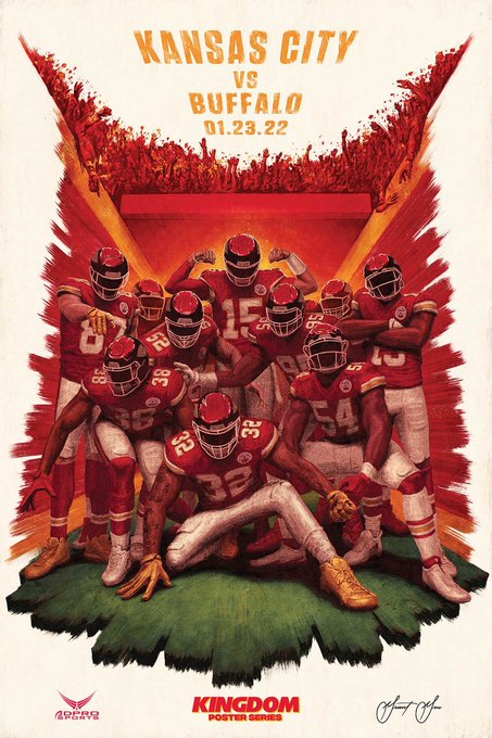
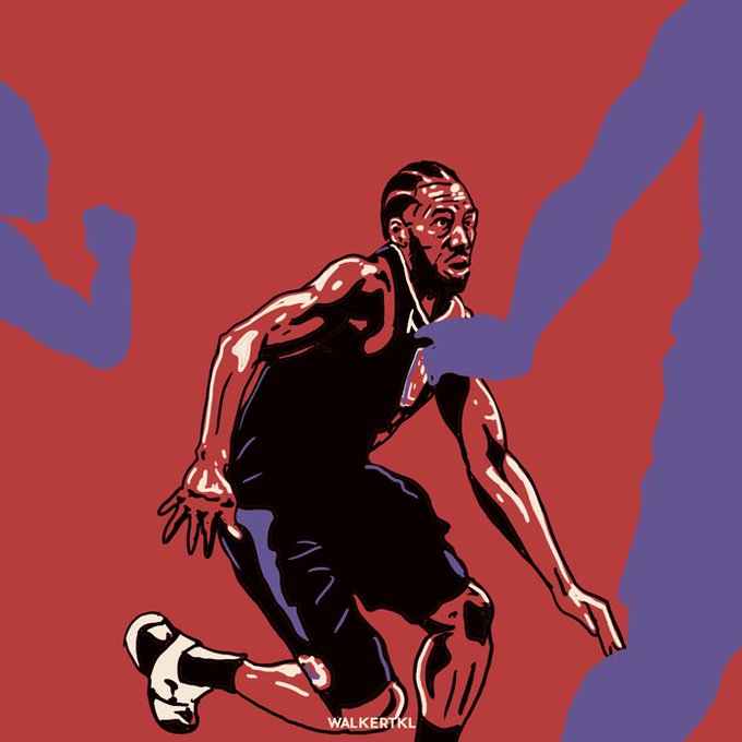
The depth to this illustration is incredible. Fantastic work @GrantGruenhaupt
2
75