323 件中 151〜160件を表示
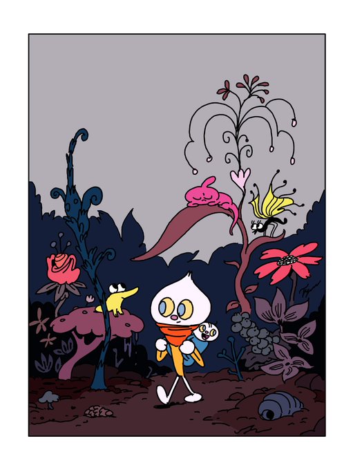
No harm in adding more to this thread, right? Here's an example of a painted neutral background, with primary colors + green in the cel-painted character and prop elements.
2
22
You get the idea. Neutrals are an important part of decisive color use.
3
43
Imagine pitching Rocky & Bullwinkle to execs now. "Brown and gray? Can't they be more colorful?"
It's because they are brown and gray that they can be couched around so many colors. They look good on any color, really.
9
64
@UijungKim Find the missing hues.
art by Lou Romano for Powerpuff Girls (1999)
A: Red, Orange, Yellow, Lime Green, Brown.
Pretty cool they're mostly missing from the lights-on version too. Though red and brown kinda show up.
1
29


