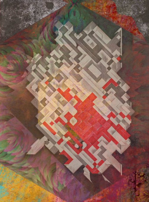
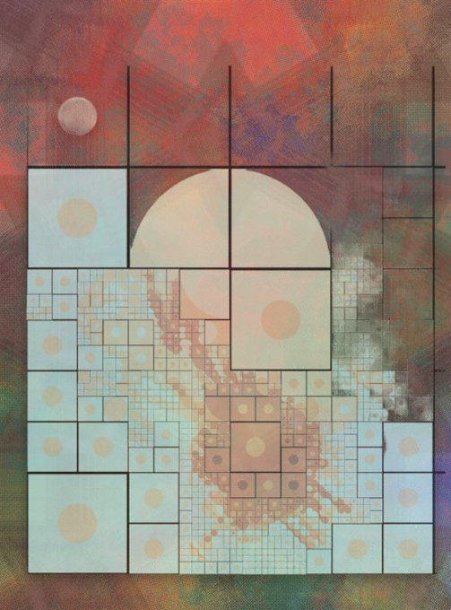
And the visual resemblences don't end with pink - don't you think that these two look somewhat similar in palette and chaotic structure? It's like one is the abstract continuation of the other.☺️
"Urban Imaginaries_001" by @c_mplx
"Broken Geometry #3" by @Deep_in4deck
2/x …and here the dark side of pink!🦩
"The Space Inside #355" by @nudoru
"Geoform #35" by @popartpixel1
"Geoform #34" by @popartpixel1
"Deluge #26" by @TijnArt
1/x My recent acquisitions and mints seem to follow a certain colour theme…☺️
Here's the bright side…
"Square, not square." by @Deep_in4deck
"Stones" by @StudioCaptain1
"Drey et la maison volante" by @puiback
3/x "eclipse" by pressedRewind produces colourful patterns that feel like retro-futuristic illustrations of starship hulls with abstract insignia on them.🚀
So far, no pieces look alike, and, coincidentally, some even remind me of "Slashes" by @MAKIO135.
https://t.co/P1YJGmJqsa
With "Connected", @lammetje_nl released what feels like a stylistic successor to their beautiful "Lamelle" I've shared before.
The artist's new release display arrays of circles that, unlike the orderly rectangles from "Lamelle", seemed to pulse through varying sizes and shades.
1/x The elephant in the room when writing about #fxhash today is, of course, "Symbolic Disturbance" by @needleundernail.
The glowing neon symbols in dense clouds of smoke look as good as teased by the artist in the WIP pictures.
4/x "Geoform" by @popartpixel1 is image-based and uses fractals, sketches and paintings to combine them into abstract grids of shapes and colours.
The resulting images are beautiful, and the iterations already minted look varied and unique.
https://t.co/mE13SwdWzD


