
Nacho Carretero Moleroさんのイラストまとめ
@carreteromoleroFollow @carreteromoleroさんをフォローする
フォロー数:3286 フォロワー数:7642


North American artist Amy Sherald depicts mostly African Americans in everyday situations, but gives her pieces a twist with a sharp use of colour both as a backdrop and in details. She also portrays skin tones in a deliberately peculiar way.
—
https://t.co/uivlHH5LFd


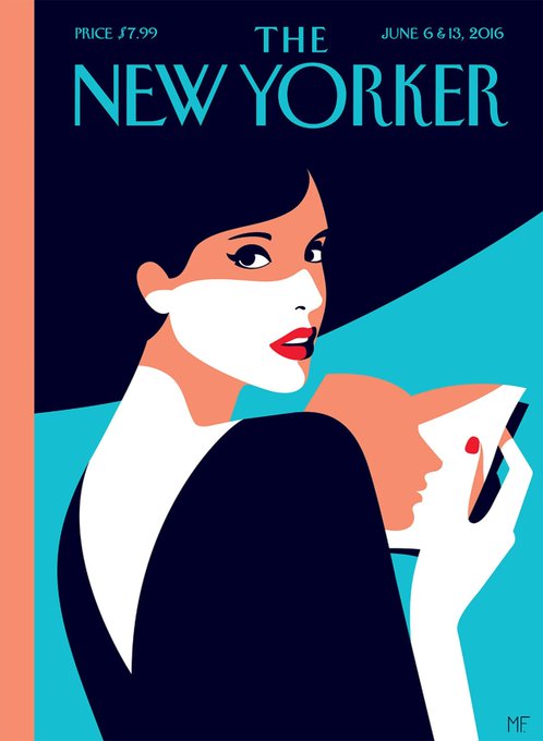
Antes del cartel ya gozaba de bastante fama gracias a sus portadas para el @NewYorker, siempre elegantes. Mención especial su portada para @VogueSpain durante el confinamiento. Preciosa.


Es difícil jugar con colores primarios y formas sencillas y no caer en lo infantil o en lo simplista. Sin embargo Malika dota a sus piezas de una enorme elegancia gracias a su equilibrada composición, la suavidad de las formas y, con frecuencia, el glamour de sus personajes.


Qué fantasía este curro de ilustración 3D de Cristian Malagón, Nuria Madrid y Mercedes Bazán para Stripe. “Focuses on the impact and intersections of energy, environment, and our daily technologies—from smartphones to rare earth mining…” ✨


El 3D permite realizar todos los juegos posibles, desde colorear a iluminar de mil maneras el mismo conjunto.


It’s always a good moment to revisit the work of London-based illustrator Charlie Davis, his pieces give an elegant mid-century vibe but with a very contemporary style. Love it.
—
https://t.co/v7LTMOFGvL


Typography is a hidden, often forgotten part of graphic design… which is a shame because it's just so fascinating. Checkout the ligatures in these two fonts, they’re FIRE.


Thought-provoking and visually striking, digging the illustration work of Spanish illustrator Alberto Miranda (@guajiro_bampo). And yes I love mustard yellow.
—
https://t.co/qPSO7vUDyl


It’s been a while since I shared some good typography work. Luckily there’s @kiss_miklos, who makes something closer to art. His latest typeface is called Chloé and in his own words it’s “elegant, playful but sometimes behaves unpredictably”. Ligature nerds, rejoice.