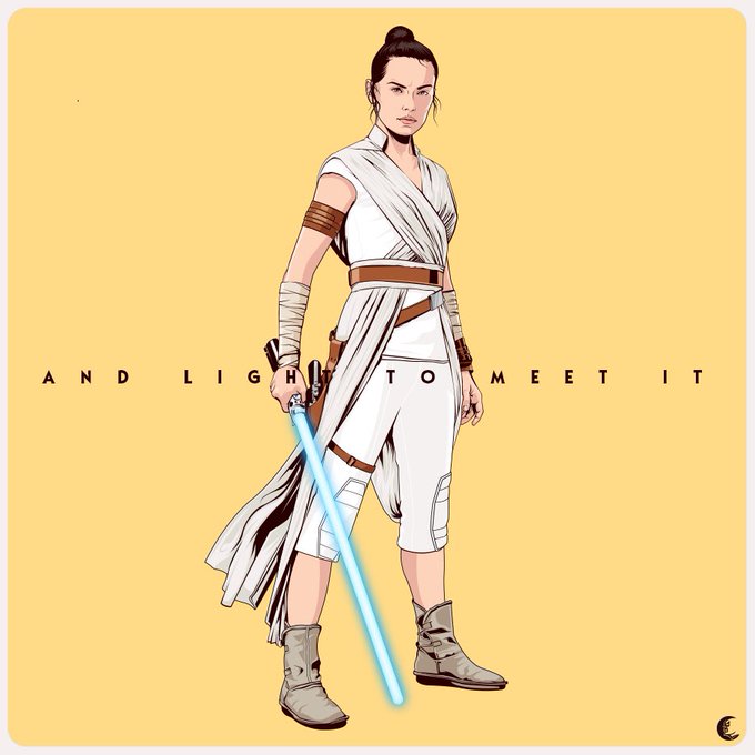
Here’s something a bit different from wrestling. “The Raven Seer” helped me to push some creative boundaries that I set to myself opening a new door to explore more ways to make art. It’s time to push forward and this piece gave me the confidence to keep it up. Hope you like it.
Showing some evolution. It’s been a long way and still nowhere were my goals are but I’m keep pushing because I’m stubborn like that. Plus I have fun with it. Let this be a motivator showing We can do better with practice.
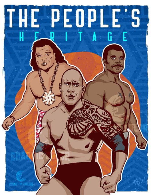
Since today was another episode of #YoungRock I wanted to share my illustration of The People’s Heritage created for the Half Nelson, a zine about biracial identity in pro wrestling by @ryandilbert . You can get yours by making a donation to Color of Change. (cc @TheRock)
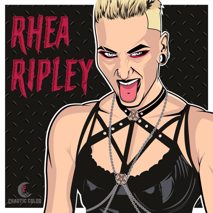
@WWE @AlexaBliss_WWE @WWEAsuka @WWEUniverse I’m here for Queen Goth Alexa!
I’m all here for Goth Queen Alexa Bliss! @AlexaBliss_WWE .
.
.
.
.
.
.
#LetMeIn #WWERaw #wwefanart
Last mayor update before the big reveal of my #RoyalRunble poster. It’s hard when people criticize your work, but there’s always room for improvement. People said that Cena looked as if he had a strap on his chin. I thought it was only a hard shadow. Well, judge by yourself
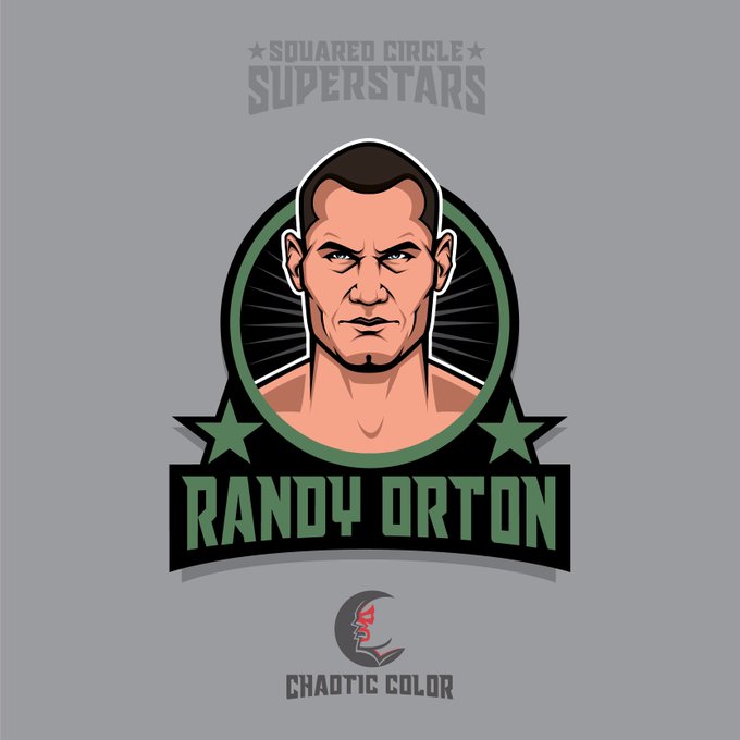
Following up updating my #RoyalRumble poster, I really had to redo @RandyOrton . He just didn’t have his old look, but also I never liked how this one came up. I think now it looks much better. Stay tuned for the revelation of the full poster soon! #wwefanart
Playing along on #PortfolioDay I’m Mau Toscano. I’m a graphic designer and illustrator focused on wrestling, sports and geek stuff. You can see more of my stuff on ig at @ chaoticcolor2.0
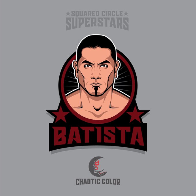
One of the comments I received on my #RoyalRumble poster, was that I should try to reflect the look of the wrestler to the time they won. And the are right. 2005 Batista didn’t look like 2014 Batista. So here’s the original illustration the new one with the old look! #wwefanart
