
Comic Colorist Artさんのイラストまとめ
@colorist_artFollow @colorist_artさんをフォローする
フォロー数:94 フォロワー数:761


From Bang, issue 1. I love the look of this. The action jumps out effectively without muting or taking away from the rest of the scenery. Minimum effects used for maximum gains from @nkdub. Super fun looking.


Day Tripper is possibly an underated body of work by Dave Stewart(?), in so much as I don’t see it mentioned as much as other things of his. The range is incredible and typical high level work and lovely palettes throughout. @Dragonmnky


Deceptively subtle work from @whoajordie in Pretty Deadly. A lightly textured feel combined with simply lovely and often stunning palettes. Drawn by @emmartian


For a book that could have been dark and gloomy, @COLORnMATT does a fantastic job at selling the fantasy world of Conan. His delicate hues and pops of color are never out of place and his work is alway in assistance to (and not against) the lovely inks of @MahmudAsrar.


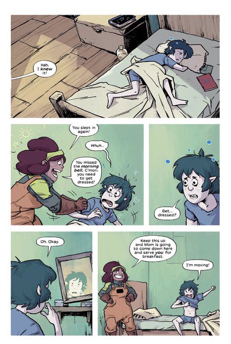
Mall pages by @AddisonDuke here look really neat. Sense of place and time achieved through the palette and texture is a good effect.


Weatherman pages really stand out. Poppy palette By @nathanfoxy as well as a nice use of holds to get the distance in the background to look great. Like the rendering on water and snow here too.


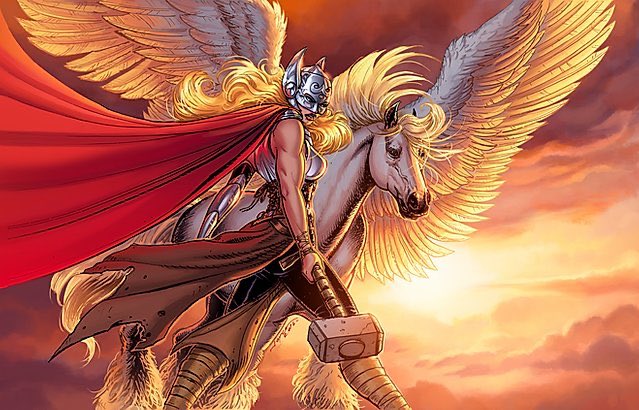
Fantastically iconic and instantly recognisable, the color work of @heyjenbartel in her own work sings with it's high but perfectly tuned saturation and will always catch your eye.