
Dan Leydon 🎨さんのイラストまとめ
@danleydonFollow @danleydonさんをフォローする
Illustrator / Designer - NIKE, Adidas, PGA Tour, MLS, WhatsApp, Coca Cola, Red Bull, Topps, LFC, DAZN - danleydon.com
linktr.ee/danleydonフォロー数:537 フォロワー数:24413
1,402 件中 541〜550件を表示

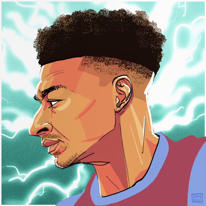
Backgrounds are SUCH a mental block area, they just stump me. I have no expertise in figuring them out. This was a quick exercise in at least stepping the background away from the subject with overlays and colour.
2
71


All the subjects touched on in my new book 'Lockdown Sketchbook 2020'
pick up your copy here: https://t.co/SqtrtpuSFs
0
0

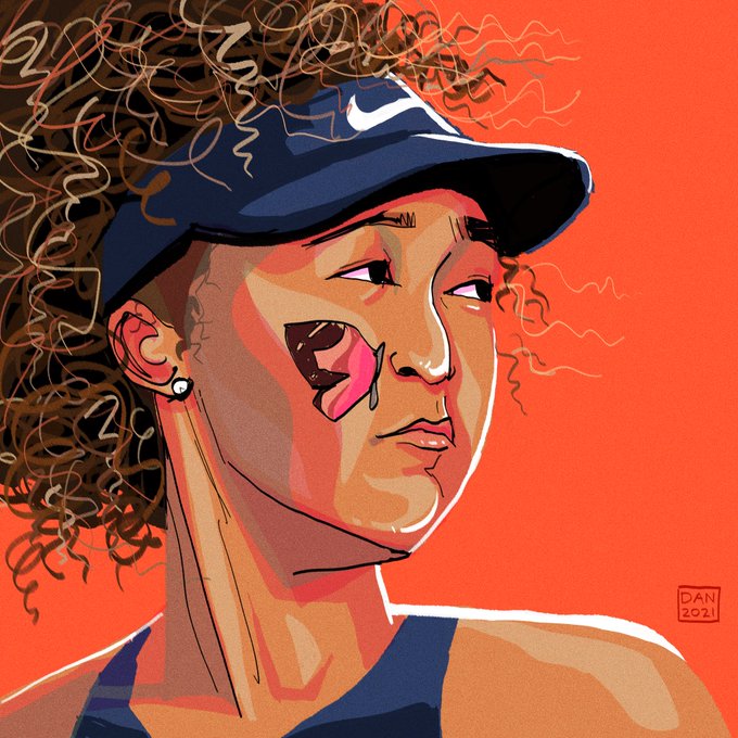
on the mbappe and osaka ones they read better at this stage rather than further on where i've indulged myself and splurged with colours
2
10

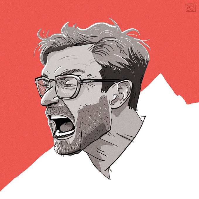
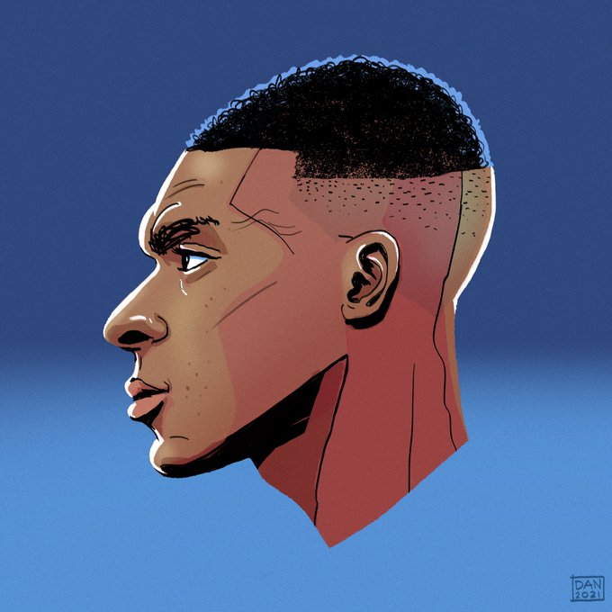
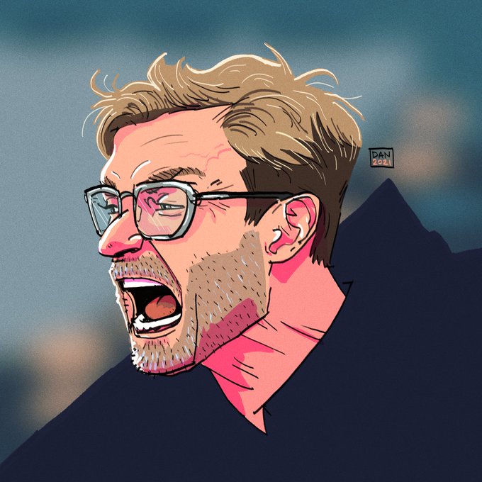
trying to make my portraits easier on the eye, like when you see the art your eye reads it quicker, i think the saturated pink shading is too bold and can work against this. so the red one is the same artwork with a different approach to colour, which i currently like more
2
54


