
⚠️ eve g ⚠️さんのイラストまとめ
@evegwoodFollow @evegwoodさんをフォローする
フォロー数:848 フォロワー数:3311


Before I forget, here's me!! #CloudCon/#CloudCon21
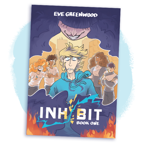
🌱 comics, zines, stickers, patches
⭐️ energetic - loud - colourful
💸 free UK shipping until Sunday evening
https://t.co/LEn9y7X2dg
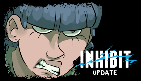
New Inhibit page! If you don't love me at my Explaining Conspiracy Theories, you can't have me at my Committing Arson.
⚡ https://t.co/YPsgzqIoOl
💸 read a month ahead at https://t.co/d1TIDlxYci

To fix this, I raised the second bubble of dialogue in the first panel, leading the eye to the correct next bubble. When you're placing lettering, make sure you take the WHOLE page into account, not just the placement in each individual panel!
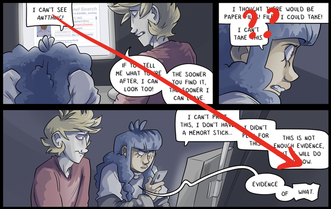
On their own, the last bubbles in the first panel look nice and neat slotted into the corner like that. But it causes issues for the surrounding panels, because it's a clue to the reader that you're meant to follow that line to the dialogue below, skipping the actual next panel.
Hey, here's your daily lettering tip! Having bubbles line up against the panel edge is a great way to save space, but it can cause flow problems. What's wrong with these bubbles?


nate's slow descent from cool and aloof into frazzled mess of a man is hysterical


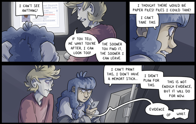
New Inhibit page! Well this is awkward.
⚡ https://t.co/YPsgzqqNWN
💸 read a month ahead at https://t.co/d1TIDlgnkK

