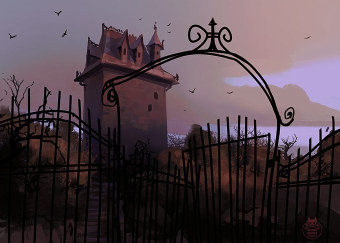
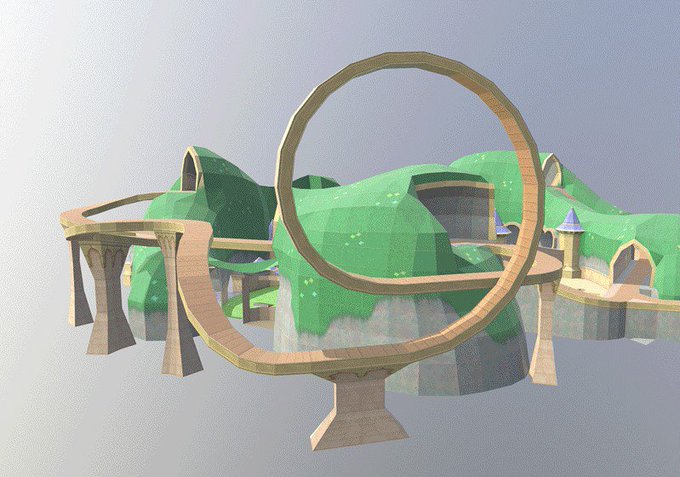
@LunaSelenium You have two things that make it hard to see depth. 1- values: The easy way would be to make the foreground elements more contrasty/dark/saturated and gradually decrease that to the back. 2- There are only a few overlaps, so it's hard to identify what's close or far away.
@LunaSelenium Hey , thanks for the submission! It's a fun and cute illustration, but I had to guess the intention a bit and took some liberties to emphesize my interpretation. Even if it's a bit off, you still can transfer my tips to the original idea.
I gotta repost this one, but properly this time, since it was buried in bad twitter cropping, which made me a bit sad. Hope you like!
It's #artstationday! And I just added a new thing I made to mine. https://t.co/3XNfBaWVJQ
@pitiwazou Is there a way to use this on sharp corners without overlap and deformation?
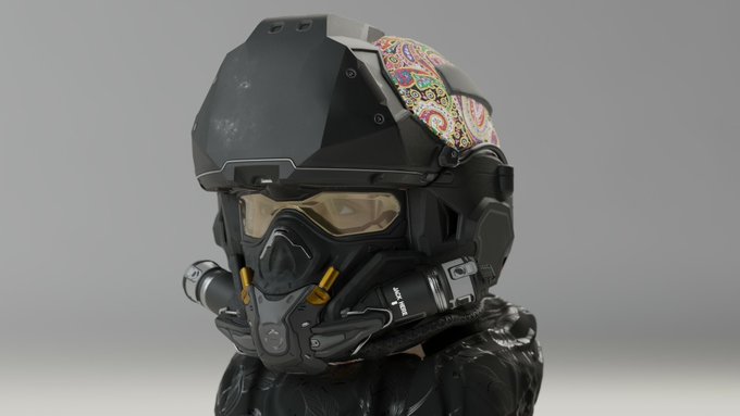
My cat rider was translated to 3D by 3D Artist Sanhanat Suwanwised. Impressive work, check it out! https://t.co/7xuTA3QjDK
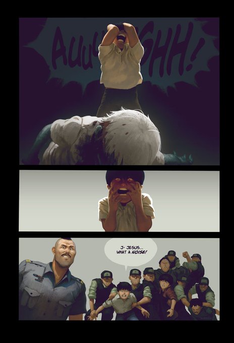
Who‘s looking forward to the freshly announced Akira series?
A good opportunity to post the panels from the comic books which I colored in 2015. Otomo created a masterpiece. I love reading it every few years.
Here's another one from #spyroReigintedTrilogy . Haven't seen it ingame yet, but looking forward to. We added a lot of great details to this level to make it feel more like a fair. Also check out how it used to look... we changed it a tiiiny bit. Hope you enjoy it nonetheless :*
