
⭐ reach for the stars ⭐さんのイラストまとめ
@kisekisymphonyFollow @kisekisymphonyさんをフォローする
フォロー数:162 フォロワー数:2077


like it's pretty obvious but it's something i hadn't thought about too much. with every new game they gradually roll the camera a bit more front-facing compare to the original games always prioritizing a bird's-eye view

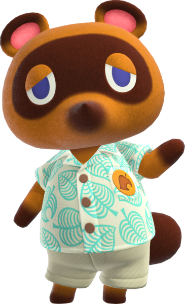


i just realized the likely reason why ACNL necessitated a shift in the character design style for animal crossing was likely because the original artstyle was optimized for a top-down JRPG view which doesn't look as good in later games where a front-facing view is prioritized
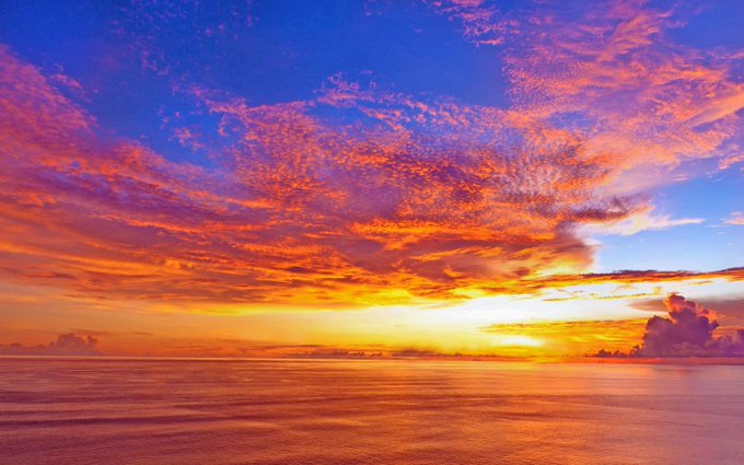

the color choices also evoke the appearance of a sunset sky, the pinks and blues of the sky and the white of the clouds and yellow of the sun, which again ties into the summer theme. the sailor uniform-esque design and various beachy accessories help complete that feeling


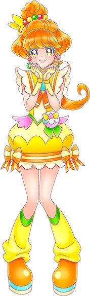
and instead of trying to cram in all the other colors of the rainbow as accents, she uses three main colors (cyan, magenta, and yellow) which cover the main areas of the rainbow while still being simple and easy to read


come on down to tropical rouge precure we have:
- silly sea sunday
- hamster with no brain
- fruit (figurative)
- fruit (literal)
- SULFUR VISION

@thehelpfulbees @witchymarisa apparently this is yuffie's dad

the rowdyruff boys look gnc afWAIT ONE OF THEM IS LITERALLY NAMED BUTCH


could it be this sad design could be the very same
a woolly man without a face and a beast without a name