
Yo, It's Matt!さんのイラストまとめ
@mshelleyartFollow @mshelleyartさんをフォローする
フォロー数:596 フォロワー数:1415


It’s been a ton of fun developing and playing with this visual style, and getting more into the world of color over the past year or so. Here’s so more opportunities and energy to do more art this year 💕

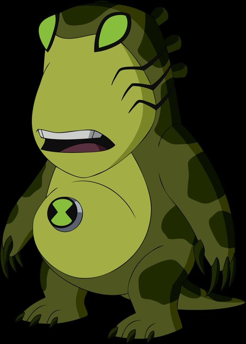
Side tangent: When redesigning OS aliens in UAF, there's two things that made the better designs work (Fourarms and Upchuck being the only examples I can think of): If you do a suit, have it be indicative of the alien's CULTURE. If it's naked, embrace how ALIEN the design is. https://t.co/6si9dqe5kT


@Joe_Quinones Ironically, the original Steve E Gordon concept and the Reboot version of Ben both had baseball-style tshirts just like Miguel too! I guess all the best morphin’ kid-heroes do lol
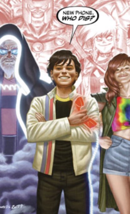
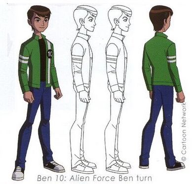
Hey @Joe_Quinones! Since Ben 10 took main influence from Dial H, I’d always wondered if Miguel’s jacket design was in-turn inspired by Ben’s jacket from Alien Force.
Fortuitous coincidence, or intentional reference?


2 examples from the same episode. Didn’t use pre-existing palettes for them cuz (shocker!) we never see them in daytime colors and never got their models, but these were hella simple edits.
If a room is on fire or you’re shooting lasers, IT CASTS LIGHT AND SHADOW!!

Fave example I love giving abt the dreaded UAF nighttime palette is that if you bother to do even simple environmental lighting on it, it’s not as much of a strain to look at and the contrast breaks up the monotony.
Even used a palette from the show, so they could’ve done this.


Ppl on spidey Twitter are really like “WHAT THE FUCK DID THEY DO TO HIM JUST LOOK AT THE ORIGINAL” and they’re both the same fucking image https://t.co/hPUZdCTpAD
