
MegaNinten007さんのイラストまとめ
@NintenCanoFollow @NintenCanoさんをフォローする
I like fighting games, videogame music, waifus
disagree with SJW
hate censorship, gringos, AI
have Asperger
#AntiWokeArmy
フォロー数:88 フォロワー数:704


@GaGe_199X Hello.
Nice silhouette.
I think it is Blue Mary.
The most beautiful and cool cop in SNK


@JackaryDraws Lien Neville from the King of Fighters Maximum Impact series.
The Gorgeous Assassin 🖤💛

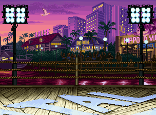
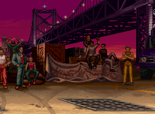
@RyujiLalo A mi igual me gusta el escenario del muelle.
Mis favoritos escenarios:
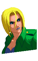
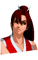

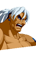
@RyujiLalo 👍
¿Porque?
A mi me gustan el como todos se ven como enojados/molestos en la pantalla de sellecion de personajes.

@RyujiLalo @JohzafatRuiz @KG_Chef_Hardy @game_oxygen999 No me habia puesto a pensar en eso.
A mi en lo personal me gusta el estilo de Darkstalkers.
Yamazaki se ve muy bien en su debut.
Lo mismo con Bob y Blue Mary.
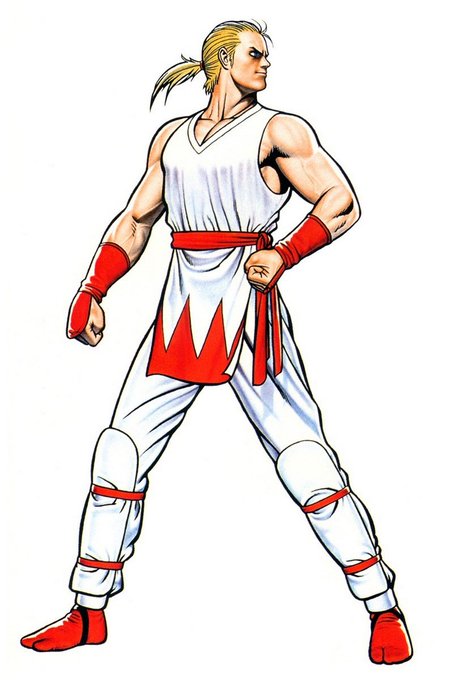
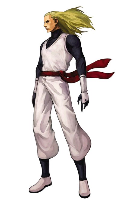
@RyujiLalo @JohzafatRuiz @KG_Chef_Hardy @game_oxygen999 Asi es.
Por ultimo que se quedara con la bufanda en vez de quitarsela antes de pelear.
Mi diseño de Andy favorito sigue siendo el de KOF 2001
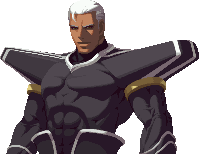

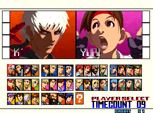


@KaceeJones8 Another thing don't like of the PS2 version is that they used the same artwork for everything.
Win portraits, character select, stryker icon and life bar.
Credits to the NG/DC version.
It has 4 different drawings for each thing.
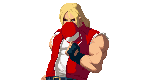

@KaceeJones8 She told me how she likes Terry's art in NG/DC because it shows more of his personality.
A lot of the art of NG is better because of how expressive the characters look compare to the PS2
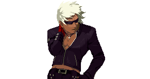
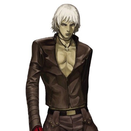
@KaceeJones8 I don't know.
Me and my sister were watching the conparision video of the art in NG/DC and the PS2 version.
We agree that the colours in the PS2 art seems off in some characters.
For example K's win portrait.
He both prefer how he looks in NG