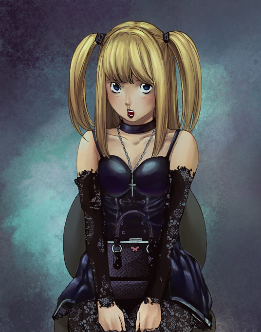
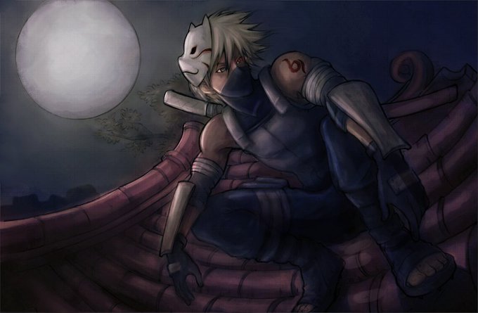
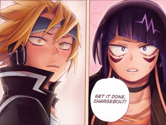
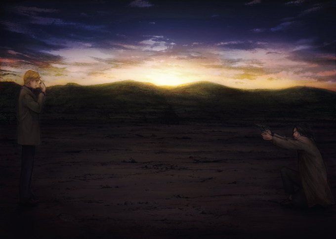
some of these had potential too,,, too bad they never getting picked back up https://t.co/08nJxgj37I
6. Change color when changing value !!!
You should always be doing this when shading. It will make your coloring interesting even if the composition is bland. Don't be afraid to go a lil crazy w it too and experiment
this is same color> same hue (diff saturation)> diff color
This is about two main things
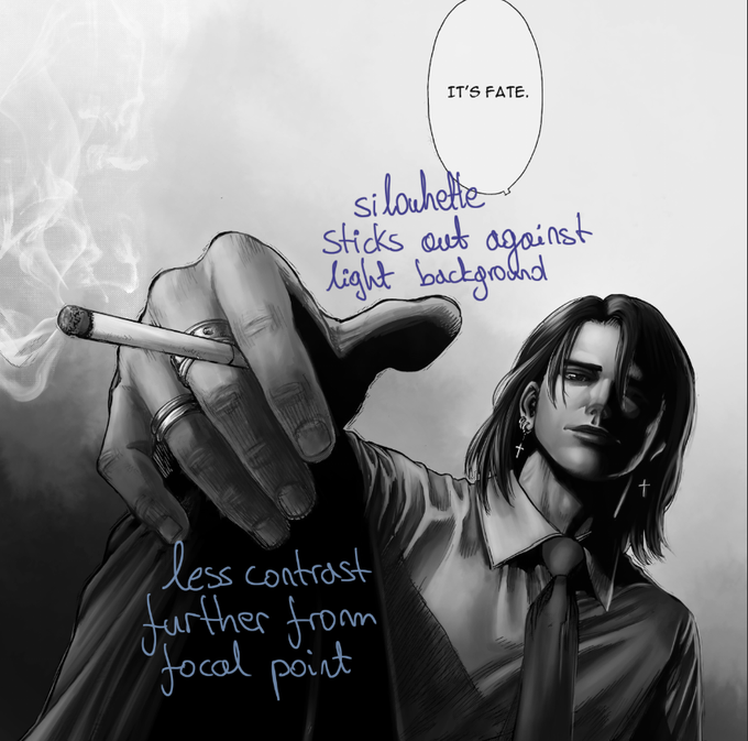
a) make sure the silhouette of the character stands out against the background instead of blending in with it
b) use different colors to help differentiate between them. e.g. in first MHA example the backg color is too similar to their skin
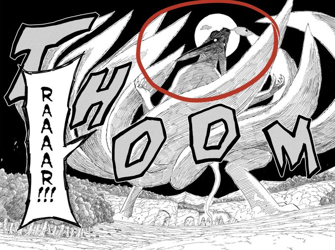
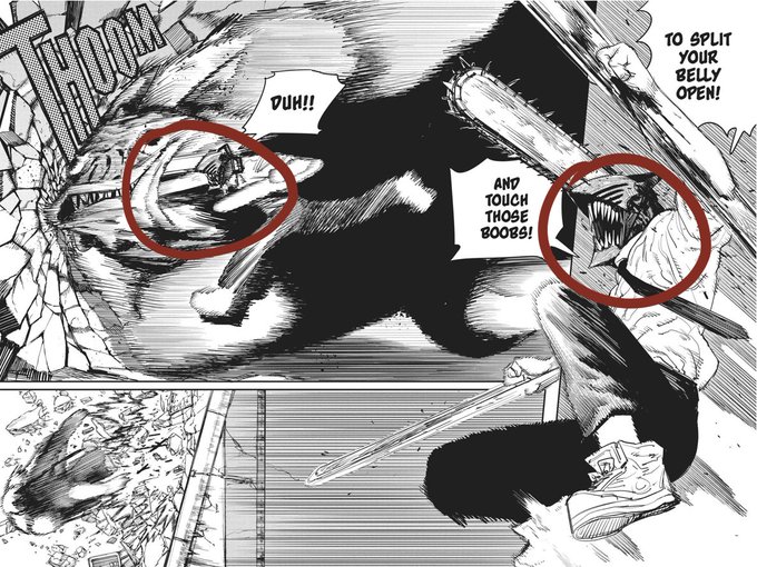
Also avoid compositions like this. There's a clear focal point here through contrast, but its in the horizon far away from the characters/action. I was thinking "if it wouldn't be visible irl I shouldn't make it visible" but its art not your physics homework bend reality a little
the idea is that values should be readable on its own: even if it's b&w and zoomed out you should be able to tell whats happening at first glance.
Viewers' eyes go to the area with most contrast, so use higher contrast around the focal point or dim the contrast of the background
1. Identify your focal points
The focal point is what you want your viewers to notice first- it should attract attention and make sense with the page. Usually the composition of page speaks for itself, and most of the time you'll want to focus on the character's face or action
speedpaint of some of it! sorry that i can't draw hands and that i havent posted in a month it is what it is


