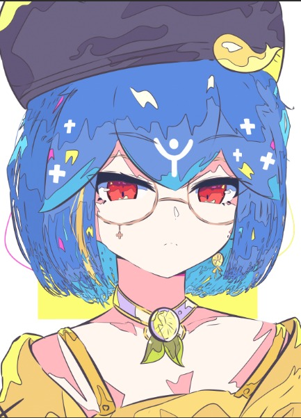
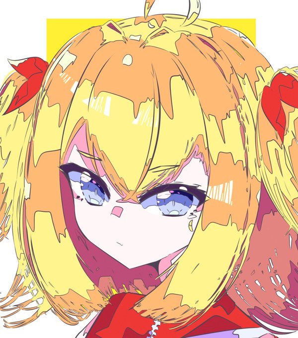
pode-se notar que a sombrancelha/olho tem quase a mesma paleta base de cor.
🔹Quando estiver pronto, vamos juntar as camadas em uma pasta (Essa parte é importante para o final).
🔹Agora vamos começar a sombrear, novamente essa parte pode mudar dependendo do seu gosto pessoal, no+
🔹Agora vamos demarcar onde vai ficar os sombreamentos e iluminações, essas linhas fazem parte do meu estilo pessoal caso consiga fazer de cabeça não se prenda a usar esse metodo.
🔹Depois vamos colocar as cores base aos redores, sempre tente seguir uma base e cor fixa+
🔵 Junho>>Agosto 🔵
@BatataComPepino
(Me desculpe pela marcação~~)
Hello~~🌹
My name is Hiro and I've been an artist for 9 years (currently 2 years as a VArtist), I spend 14 hours a day studying and working with illustrations and I sincerely hope to help you with the little knowledge I'm learning daily~~
🔹Now, have fun using different gradients and choose your favorites, I hope you have fun trying out different colors.
🔹Now let's change the layer to "Soft Light" it can also be used as "Hard Light", doing this you can already notice a difference in your colors, now let's put the layer at 33% or the way you would like to highlight the colors.
🔵彡Tips from a Demon Artist 4# (Gradient Map)彡🔵
🔹Gradient Map is a color palette tool that can help you correct some colors in your drawings, many artists have their own Gradient and you can use them to register your brand.
Hello~~🌹
My name is Hiro and I've been an artist for 9 years (currently 2 years as a VArtist), I spend 14 hours a day studying and working with illustrations and I sincerely hope to help you with the little knowledge I'm learning daily~~💜


